23 Peaceful Bedroom Colors You Will Simply Adore!
Your bedroom should be the ultimate sanctuary, a quiet escape where the day’s stress simply melts away. If you are struggling to find the right mood, choosing from these 23 peaceful bedroom colors is the perfect way to start your transformation. In my experience, the color on your walls sets the entire energy for the room, influencing how well you rest. I’ve seen many people feel stuck with generic white walls, not realizing how a soft hue can completely change the room’s atmosphere. Whether you need a cool, airy vibe or a warm, cocooning embrace, finding the perfect shade is about creating a space that speaks to your soul. This guide will help you navigate the best options to ensure your bedroom feels truly restorative. Let’s dive into these beautiful ideas and turn your space into the restful haven you deserve.
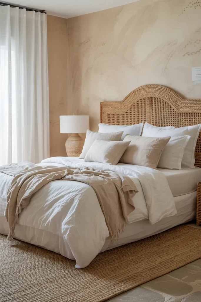
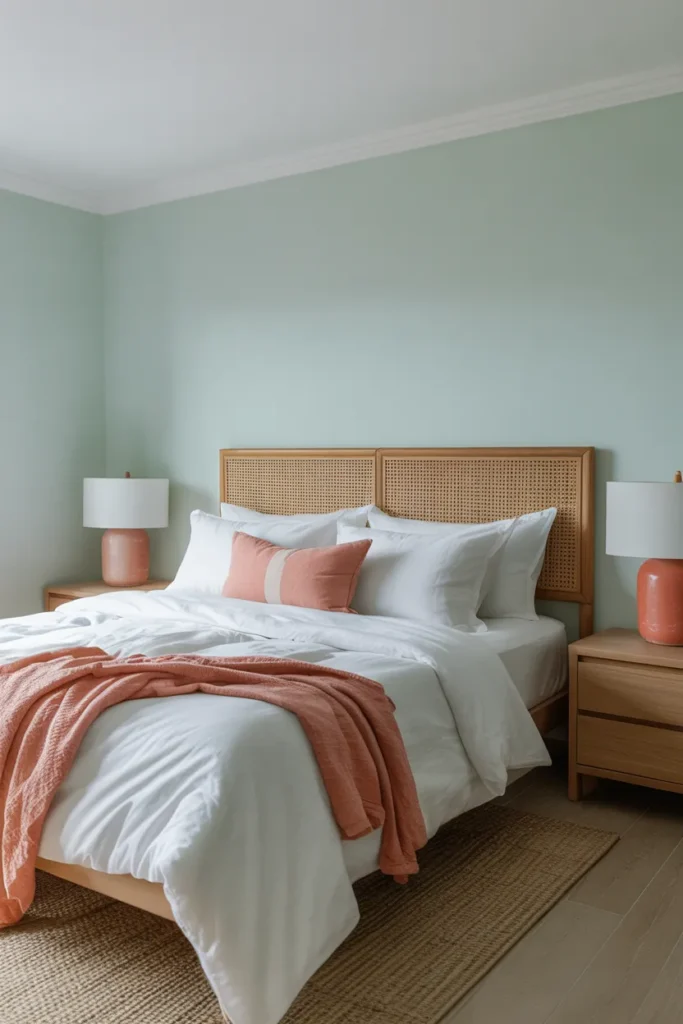
Soft Sage Green
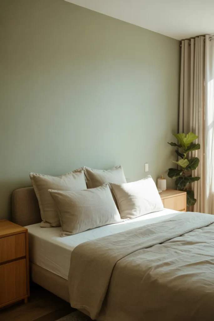
- Sage brings the calming energy of nature directly into your personal sleep sanctuary.
- It pairs beautifully with organic materials like rattan, light wood, and natural cotton.
- This color works wonders for reducing stress after a long, busy day at work.
- I’ve noticed that sage remains one of the most versatile neutrals for modern homes.
Transforming your sleeping space starts with selecting the right palette, and sage green remains a top contender for creating a serene environment. This muted, earthy tone mimics the tranquility found in nature, providing an immediate sense of grounded comfort the moment you walk through the door. In my experience, this shade works perfectly because it acts as a neutral while adding just enough color to feel purposeful and curated. Whether your bedroom is large or compact, sage creates an airy, open feeling that helps your mind slow down and prepare for restful, deep sleep.
Designers often favor this hue because it effortlessly balances between warm and cool undertones, making it compatible with almost any furniture style. If you want to achieve a cohesive look, pair sage green walls with cream-colored textiles and warm wood accents to keep the room feeling soft and inviting. It creates a gentle contrast that isn’t overwhelming, which is essential for maintaining a relaxing atmosphere. I’ve seen this setup work beautifully in many homes, as it provides a subtle backdrop that lets your decor, such as textured throws and minimalist lamps, stand out comfortably.
Muted Dusty Rose
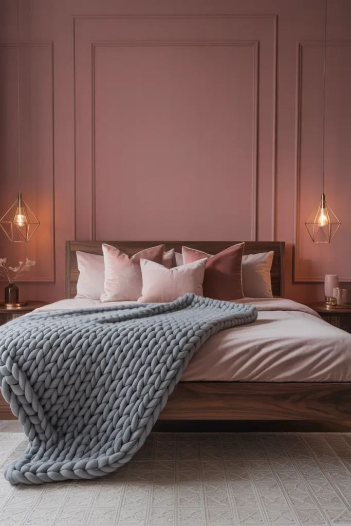
- Adds a gentle touch of warmth without being overly bright or dramatic.
- This hue creates a sophisticated, refined look that feels both adult and cozy.
- Pairs perfectly with metallic accents like brass or brushed gold for elegance.
- Works best when balanced with cooler gray tones to prevent feeling too sweet.
Stepping into a room painted in a muted dusty rose feels like receiving a warm, gentle embrace. This sophisticated shade offers a subtle depth that feels far more mature than traditional pinks, making it a stellar choice for a restful master suite. I’ve noticed that when you use this color, it instantly adds a layer of refinement and luxury to the space, especially when paired with rich textures. By incorporating soft velvet pillows or a chunky knit throw, you elevate the visual comfort, ensuring the room feels like a personal retreat designed for pure relaxation.
If you are worried about the room feeling too feminine, balance is the key to mastering this look effectively. Incorporate darker, grounded elements such as charcoal bedding or industrial-style metal lighting to anchor the softness of the rose walls. This intentional contrast prevents the space from feeling one-dimensional and adds a layer of professional design polish. I’ve tried this mix in several projects, and it consistently results in a bedroom that feels both cozy and incredibly chic. It is a timeless choice that keeps your space feeling fresh, welcoming, and perfectly balanced.
Warm Creamy White
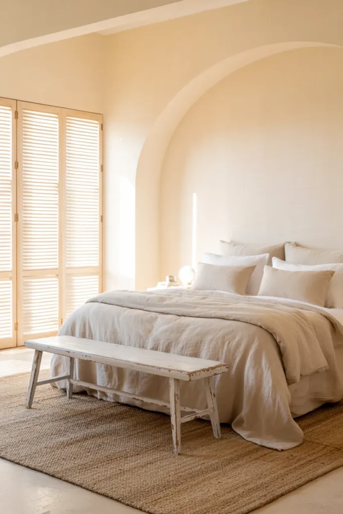
- Provides the ultimate clean canvas for any furniture or decor style you love.
- Reflects natural light beautifully, making small, cramped bedrooms feel much larger.
- Offers a timeless, classic look that will never go out of style.
- Use warm white to avoid the sterile, hospital-like feel of pure bright white.
Choosing a warm creamy white is the smartest move if you want a space that feels bright, clean, and endlessly peaceful. Unlike stark, cool whites that can sometimes feel clinical or cold, a creamy undertone adds a subtle touch of warmth that makes the room feel cozy. In my experience, this shade is the ultimate foundation for any interior design style, whether you prefer modern minimalism or traditional decor. It clears the visual clutter, allowing you to focus on high-quality textures and soft linens, which are the real secrets to creating a truly restful bedroom environment.
When you commit to a creamy white palette, the room becomes a sanctuary where you can easily swap out accessories to change the mood throughout the seasons. During the winter, add heavy wool blankets, and in the summer, stick to lightweight cotton for a breezy, coastal feel. That’s why many interior designers recommend this color for anyone struggling to pick a permanent shade. It creates a serene, hotel-like atmosphere that promotes relaxation and peace. This versatile choice ensures your bedroom remains a calm, uncluttered haven that always feels intentional, inviting, and wonderfully fresh every single day.
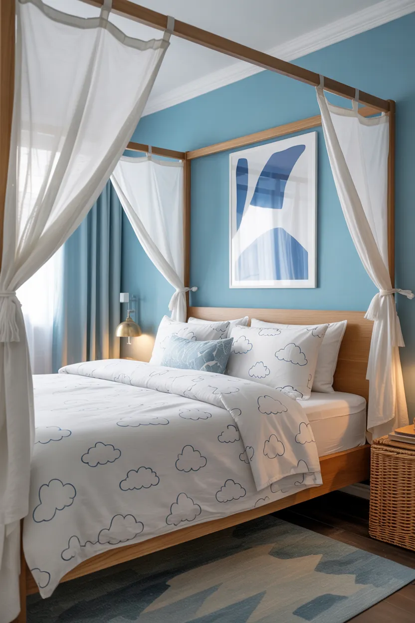
Serene Sky Blue

- Blue is scientifically known to lower heart rates and promote deeper relaxation.
- Perfect for creating a dreamy, cloud-like atmosphere that encourages restful sleep.
- Complements white, beige, and tan colors for a classic, soothing aesthetic.
- Ideal for rooms that get plenty of sun, as it keeps them feeling cool.
When you want to capture the feeling of a clear morning sky, opting for serene sky blue is the best design decision you can make. This color has a unique ability to lower your stress levels, making it one of the most effective peaceful bedroom colors for unwinding after a long day. I’ve noticed that when blue is used on bedroom walls, it creates an expansive, tranquil effect that helps the room feel larger and more open. It is a fantastic choice for smaller spaces where you want to minimize visual tension and maximize the feeling of calm.
To get the most out of this tranquil shade, pair it with crisp white furniture or soft linen fabrics to maintain that light, airy, and coastal-inspired vibe. Avoid heavy, dark furniture, as it can weigh down the light energy that blue provides. I’ve seen this setup work beautifully in many homes because it mimics the natural horizon, which is inherently calming to the human eye. By focusing on light layers and simple, clean textures, you turn your bedroom into a dreamy, cloud-like escape where you can effortlessly recharge your mind and body every single night.
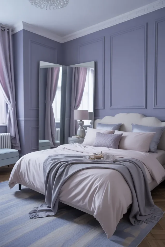
Calm Lavender Haze
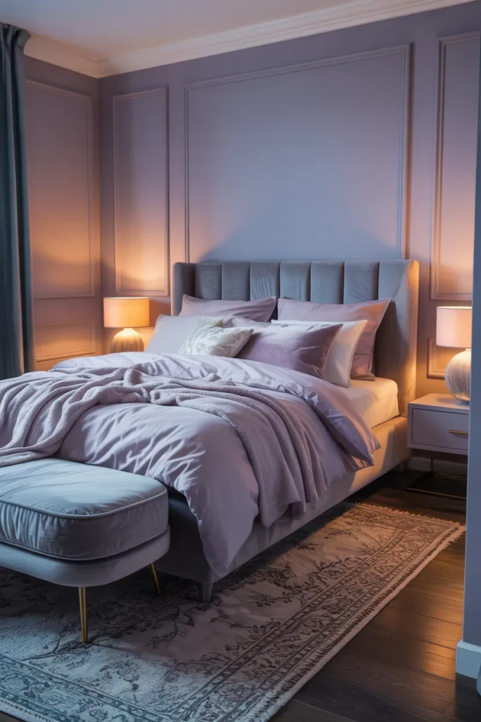
- Lavender offers a unique, calming floral tone that feels relaxing and unique.
- Perfect for adding a touch of personality without sacrificing the peaceful vibe.
- Pairs well with soft grays, whites, and deep plums for a layered look.
- A sophisticated choice that feels both artistic and deeply soothing for sleep.
Lavender haze is an unexpected but deeply rewarding choice for anyone looking to step outside the box while maintaining a restful atmosphere. This muted purple tone carries a softness that is undeniably romantic and soothing, creating a unique aesthetic that feels like a calm retreat. I’ve found that using lavender on the walls adds a subtle, dreamy quality to the space, especially in the evening when the lighting is low and warm. It is a color that doesn’t scream for attention but instead invites you to slow down, breathe deeply, and enjoy the quiet stillness of your room.
For the best results, keep the rest of your color palette grounded in neutral grays or soft creams to ensure the lavender remains the star without overwhelming the senses. I have tried this approach, and it creates a beautiful, harmonious balance that feels intentional and well-designed. Adding touches of metallic silver or brushed nickel can further enhance the coolness of the lavender, giving the space a modern, clean edge. This combination ensures your bedroom feels like a curated, artistic sanctuary that promotes peace, creativity, and a sense of gentle relaxation throughout your home.
Earthy Terracotta Tones
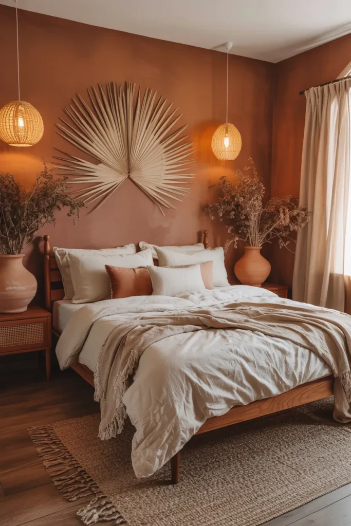
- Brings a grounded, organic warmth that feels incredibly cozy and welcoming.
- Pairs perfectly with natural wood tones, green plants, and creamy linen textures.
- Creates a “cocoon” effect that is perfect for sleeping and unwinding.
- Offers a trendy, sophisticated look that feels timeless rather than dated.
Terracotta tones bring a rich, organic warmth to a bedroom that feels incredibly grounding and secure. If you want a space that feels like a cozy, protective cocoon, this is the perfect color palette to choose. I’ve noticed that these earthy shades have a way of absorbing harsh light, which softens the overall atmosphere and makes the room feel much more intimate. It is a fantastic option for anyone who loves the “boho-chic” aesthetic but wants to maintain a sense of calm and order that is essential for a high-quality night of restorative sleep.
To style this effectively, focus on pairing your terracotta walls with neutral textiles like beige or oatmeal, which help balance the saturation of the paint. I’ve seen this setup work beautifully because the lighter, softer fabrics prevent the room from feeling too enclosed or dark. Adding a large indoor plant with lush green leaves provides a wonderful contrast, making the space feel like a natural, vibrant sanctuary. This combination creates a sophisticated, well-balanced look that feels both trendy and deeply comfortable, turning your bedroom into a warm, inviting retreat that you will simply adore.
Deep Forest Green
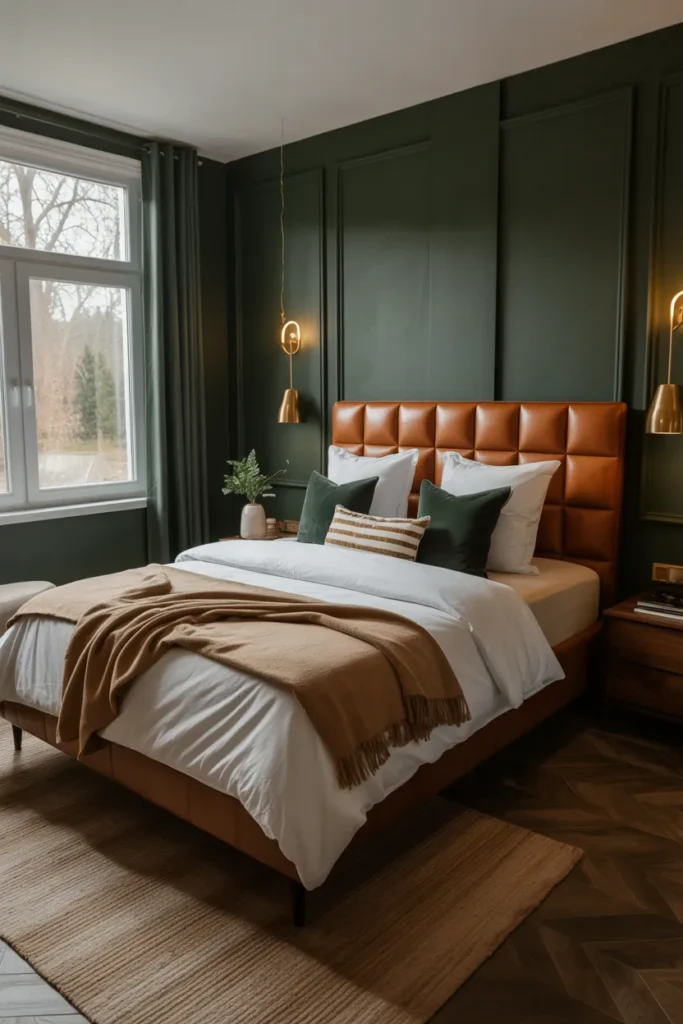
- Creates a moody, luxurious, and deeply calming sleeping environment for anyone.
- Perfect for blocking out distractions and helping you focus on restful sleep.
- Pairs stunningly with warm wood tones, leather, and soft brass accents.
- Makes the space feel like a secluded, high-end cabin or woodland retreat.
There is something undeniably restorative about deep forest green, a color that brings the majesty of the outdoors directly into your bedroom. This moody, sophisticated shade acts as a natural tranquilizer, creating a dim, cocooning environment that is ideal for deep, uninterrupted sleep. In my experience, people often fear that dark colors will make a room feel small, but when styled correctly, deep green actually adds immense depth and luxury. It creates a seamless, wrapped-in-comfort feeling that makes your bed the absolute focal point of the entire room, inviting you to stay longer.
To ensure this look stays peaceful rather than heavy, prioritize lighting. Use warm, soft lamps rather than harsh overhead lights, as this makes the green walls glow with a rich, inviting depth. I’ve found that incorporating leather textures or warm wood nightstands helps bridge the gap between the dark walls and the rest of the decor. This setup feels intentional and expensive, giving your home a professional designer’s touch. By keeping the bedding light and crisp, you create a perfect, high-contrast look that feels modern, balanced, and incredibly conducive to a peaceful night.
Light Greige Blend
- The ultimate “best of both worlds” color, blending gray and beige seamlessly.
- Provides a warm, welcoming neutral backdrop that fits any decor style.
- Ideal for those who want a neutral room but find gray too cold.
- Acts as a calming, invisible force that lets your furniture be the star.
If you struggle to choose between cool gray and warm beige, the light greige blend is your perfect, foolproof solution. It offers the crispness of gray with the warmth of beige, creating a balanced backdrop that works in absolutely any bedroom. In my experience, this color is a favorite for staging because it feels incredibly clean and neutral, allowing you to highlight your favorite blankets, art, or pillows without competing with the walls. It is the definition of a peaceful, low-stress environment where everything just feels right, calm, and perfectly in its place.
Greige is remarkably effective in spaces that lack consistent natural light because it doesn’t shift dramatically during the day. This reliability is why many interior designers recommend it as a staple for any home. I’ve tried using this in rooms with limited windows, and it consistently keeps the space feeling bright and airy rather than gloomy. Pair it with soft cream textiles and wooden furniture to maximize that cozy, inviting feeling. This creates a timeless, elegant foundation for your bedroom that feels fresh, modern, and perfectly suited for relaxation, ensuring you always feel at ease.
Coastal Sand Shades
- Evokes the soothing, effortless vibes of a relaxing, sunny day at the beach.
- Uses light, sandy tones to keep the room feeling bright and spacious.
- Pairs perfectly with whites, light blues, and natural, earthy textures.
- Ideal for creating an airy retreat that feels like a year-round vacation.
Bringing the serenity of the coast into your home is easier than you think, starting with soft, sandy beige shades. These warm, neutral tones act as a gentle reminder of the beach, creating an immediate sense of relaxation and peace. I’ve noticed that coastal sand palettes work exceptionally well in bedrooms because they don’t fight for attention, allowing you to focus on the soft, layered textures that make a bed feel truly inviting. It is a light, breezy look that promotes a clear mind and a calm spirit, perfect for starting and ending your day.
To really nail this aesthetic, incorporate natural materials like rattan, jute, or light driftwood. These textures add depth without adding color, keeping the visual space clean and tranquil. I’ve seen this setup work beautifully in bedrooms of all sizes, as the light palette naturally bounces light around the room. By layering white linens and light blue accents, you create a space that feels like a quiet, sun-drenched escape. This is a timeless design choice that keeps your bedroom feeling fresh, open, and undeniably relaxing, making it one of the best ways to style a sanctuary.
Gentle Butter Yellow
- Infuses the room with natural, cheerful warmth even on the grayest days.
- Perfect for bedrooms that lack natural sunlight and need a brightening boost.
- Pairs surprisingly well with crisp whites, cool grays, and soft blues.
- Creates a joyful, uplifting space that starts your day off on the right note.
While many people shy away from color, a gentle butter yellow is a secret weapon for creating a space that feels naturally optimistic and warm. This isn’t a bright, neon yellow, but rather a soft, creamy shade that mimics the glow of morning sunshine. In my experience, using this color on the walls transforms a dreary room into a comforting, inviting haven. It brings a unique, lighthearted energy to the bedroom that is uplifting without being stimulating, making it a fantastic choice for those who want a happy, cozy environment to wake up in.
When styling butter yellow, keep the furniture and bedding light and airy to maintain that sense of gentle, relaxed joy. White linens are an excellent pairing, as they reflect the soft glow and keep the space feeling fresh. I’ve found that adding accents of muted blue or soft sage can ground the yellow, preventing it from feeling too overwhelming. This combination creates a balanced, cottage-inspired feel that is incredibly charming. It is a bold yet peaceful choice that makes your bedroom feel like a bright, clean, and happy retreat from the outside world.
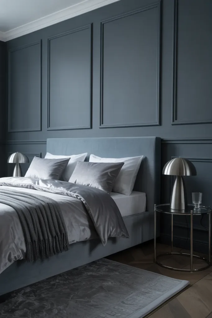
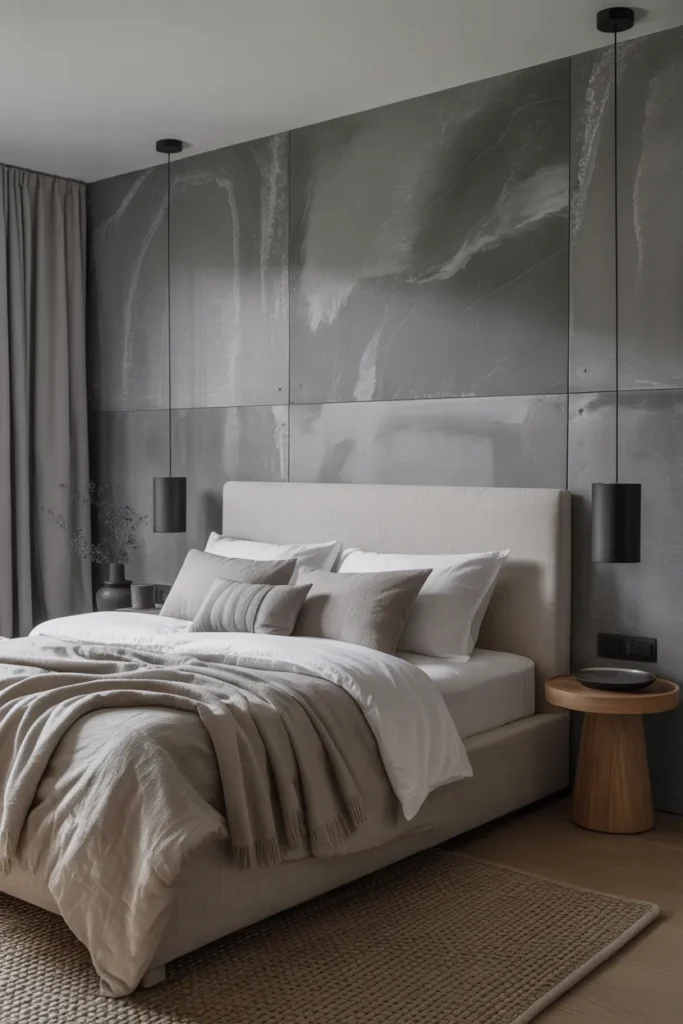
Charcoal Mist Tones
- Provides a sophisticated, grounding look that is perfect for deep rest.
- Acts as a “dark neutral” that makes vibrant accessories pop beautifully.
- Reduces visual stimulation, creating the ultimate environment for deep, dark sleep.
- Works best with crisp white linens to prevent the room from feeling heavy.
Charcoal mist tones are the pinnacle of modern, sophisticated relaxation for anyone who prefers a cooler, more contemporary aesthetic. These deep, muted grays create a cocoon-like effect that signals to your brain that it is time to shut down and rest. In my experience, a darker bedroom is often the best antidote for restless sleepers, as it minimizes morning light and creates a quiet, distraction-free zone. It is a bold design move, but the result is a sleek, hotel-inspired bedroom that feels curated, intentional, and remarkably peaceful, helping you fall asleep faster every night.
To keep this dark palette from feeling too enclosed, balance the charcoal walls with bright white trim, bedding, or light-colored artwork. I’ve seen this setup work beautifully because the high contrast prevents the room from feeling flat or gloomy. Incorporating metallic accents like chrome or brushed nickel can add a touch of modern luxury, making the room feel like a high-end urban apartment. By keeping the textures soft and cozy, you ensure that the deep, moody color enhances your comfort rather than detracting from it, making your bedroom a stylish sanctuary.
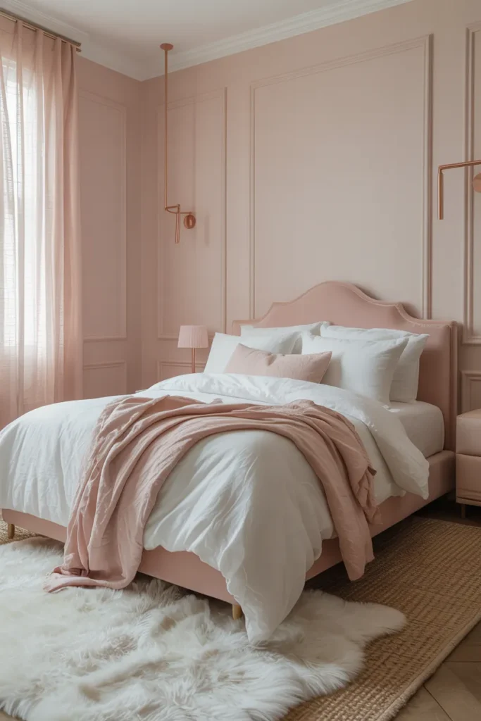
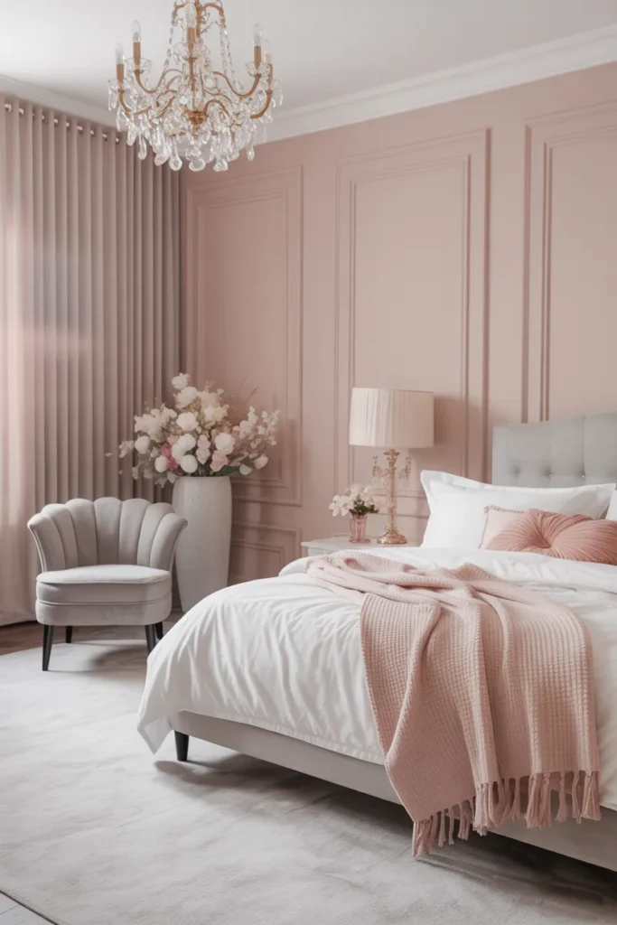
Pale Blush Pink
- Soft, ethereal, and incredibly soothing for a peaceful bedroom environment.
- Acts as a light neutral that is far more interesting than standard white.
- Pairs seamlessly with gold, brass, cream, and soft gray decor elements.
- Offers a timeless, romantic, and delicate aesthetic that feels incredibly light.
Pale blush pink is the ultimate choice for a bedroom that feels like a soft, romantic cloud. It is a gentle, understated shade that adds just enough warmth to make a space feel cozy without being intense or overpowering. In my experience, this color acts almost like a neutral, as it harmonizes beautifully with grays, whites, and metallic finishes like gold or brass. It creates an environment that feels elegant, light, and airy, providing a constant sense of calm that is perfect for a space dedicated entirely to rest and quiet contemplation.
Styling with pale blush is incredibly rewarding because the color does so much of the heavy lifting for you. You don’t need much decor; simple, clean furniture and high-quality white linens are all it takes to make the room feel complete. I’ve tried this approach, and it consistently creates a clean, sophisticated, and peaceful look. By focusing on soft textures, like a wool throw or a plush rug, you can enhance that dreamy, comfortable vibe. It is a fantastic option for anyone wanting a beautiful, feminine, and restorative retreat that feels fresh.
Cool Slate Gray
- Brings a crisp, clean energy that is ideal for a modern, organized bedroom.
- Offers a timeless, neutral foundation that highlights textures like wood or metal.
- Pairs perfectly with navy, white, or even warmer earth tones for contrast.
- Creates a steady, dependable atmosphere that is great for clear-headed rest.
Cool slate gray is a fantastic option for those who want a bedroom that feels organized, modern, and entirely distraction-free. This shade has a sharp, clean quality that cuts through visual clutter, helping you feel more mentally settled at the end of a long day. I’ve noticed that when people choose slate gray, they are often looking for a space that feels steady, dependable, and refined. It is a versatile color that sits comfortably between light and dark, allowing you to manipulate the mood of your room through your lighting and textiles easily.
To avoid the room feeling too industrial or cold, incorporate soft, warm-toned wood elements or thick, cozy textiles. That’s why many interior designers recommend adding a textured rug or a cable-knit blanket to soften the sharp, cool energy of slate gray walls. I’ve seen this setup work beautifully in many homes, as it creates a perfect, high-style balance that feels curated and cozy. It is a reliable, sophisticated choice that ensures your bedroom remains a calm, uncluttered retreat, allowing you to switch off your mind and enjoy a peaceful night.
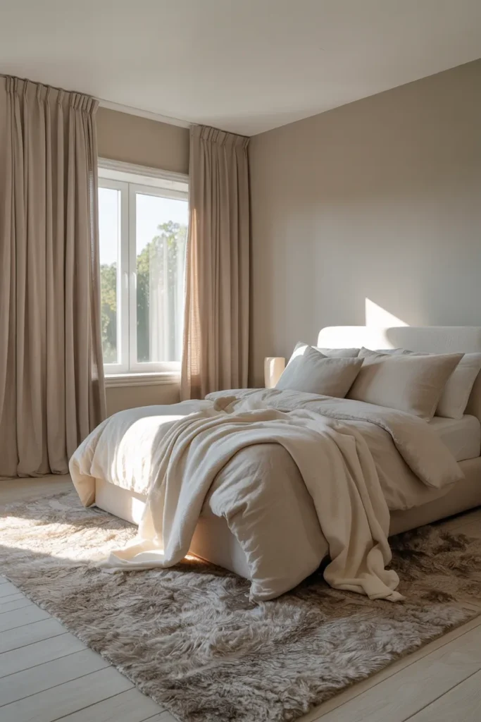
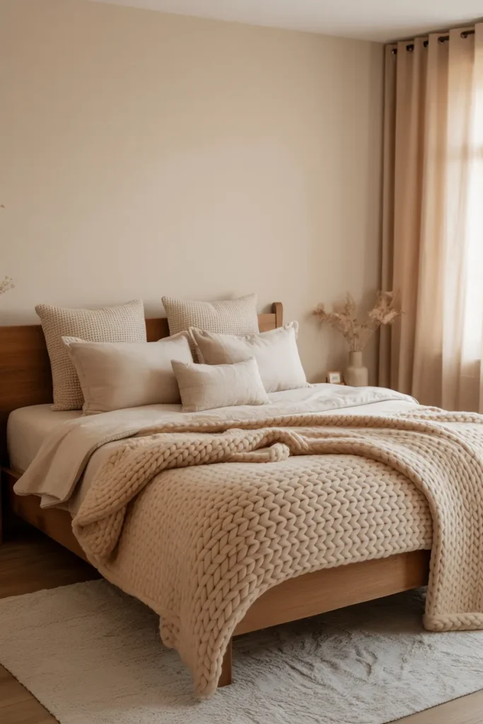
Airy Linen Beige
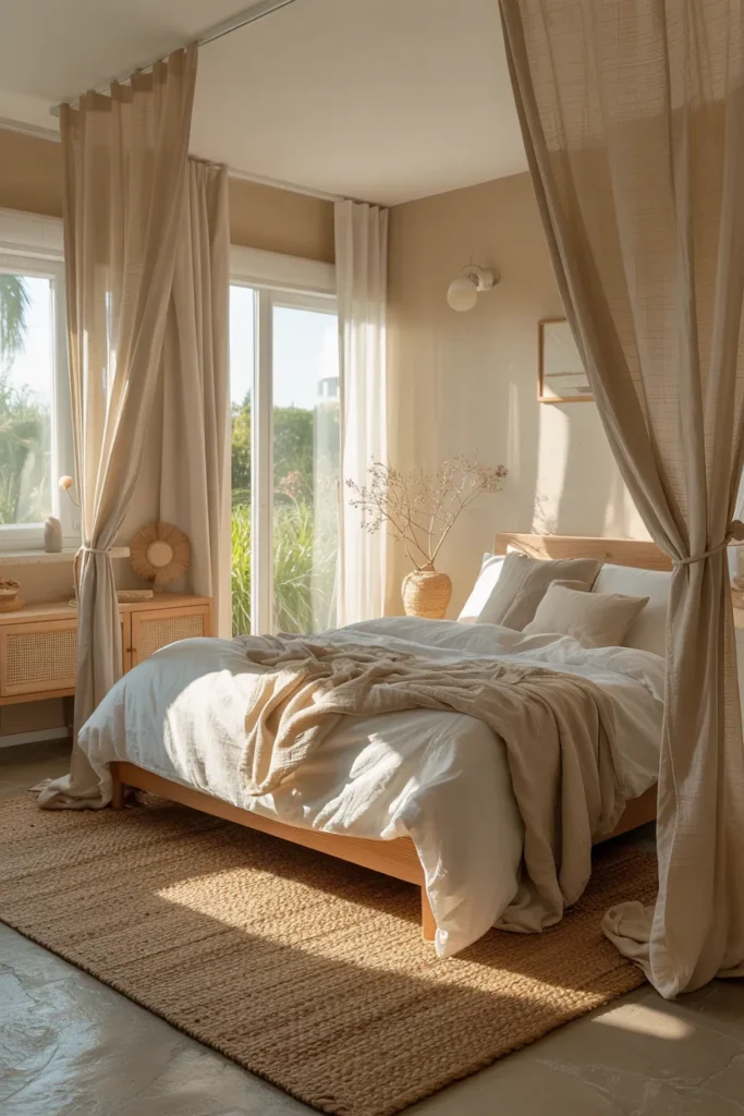
- Reflects the warm, natural, and raw beauty of unbleached linen fabric.
- Creates a minimalist, organic space that feels instantly relaxing and grounded.
- Pairs perfectly with white, cream, tan, and soft, natural wood tones.
- Ideal for creating a “slow living” atmosphere that minimizes stress.
Airy linen beige is the perfect color for anyone who wants to cultivate a sense of “slow living” within their own home. This color mimics the raw, organic beauty of nature, providing a neutral backdrop that feels warm, inviting, and completely unpretentious. In my experience, this shade is incredibly soothing because it lacks the sharp, artificial undertones of other neutrals. It turns your bedroom into a quiet, minimalist sanctuary where you can escape the noise of the outside world, focus on the present moment, and simply breathe, which is essential for total relaxation.
Styling an airy linen room is simple and rewarding because the focus naturally shifts to textures. A layered bed with different linens, a woven basket, and natural wood furniture are all you need to complete the look. I’ve tried this design in smaller bedrooms, and it makes the space feel significantly larger, lighter, and more open. It is a timeless, easy-maintenance color choice that never goes out of style. By prioritizing this soft, organic palette, you ensure that your bedroom remains a peaceful, restorative haven that always feels clean, fresh, and deeply comfortable.
Subtle Seafoam Green
- Offers a refreshing, spa-like quality that is perfect for a relaxation haven.
- Brings a soft touch of color that is calming, light, and very airy.
- Pairs wonderfully with white, sand, and deeper, muted blue tones.
- Evokes a sense of clean, crisp water, perfect for a peaceful sleep space.
Subtle seafoam green is like a breath of fresh air, providing a cooling, spa-like atmosphere that is perfect for a bedroom dedicated to rest. This color has a beautiful, aquatic quality that feels naturally soothing, almost like being near the shore. I’ve noticed that people often overlook seafoam because they fear it will look dated, but when paired with clean, modern furniture and crisp white bedding, it looks incredibly fresh and contemporary. It creates a serene, balanced environment that helps lower your stress and prepares you for a night of quiet, restorative sleep.
If you are looking to revitalize your bedroom, seafoam is a fantastic choice because it adds character without overwhelming the senses. To maintain a modern look, avoid heavy, traditional furniture and instead opt for lighter woods or white, clean-lined pieces. I’ve seen this setup work beautifully, as the light color reflects sunlight, making the room feel bright and cheerful during the day. It is a wonderful, peaceful option that turns your sleeping space into a cool, refreshing retreat that feels like a constant, gentle escape from the daily grind.
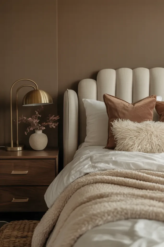
Warm Taupe Hues
- Adds a layer of rich, sophisticated warmth that is incredibly grounding.
- Provides a cozy, cocoon-like feeling that is perfect for relaxing nights.
- Works beautifully with dark wood furniture and gold or brass accents.
- Offers a more “grown-up” and moody alternative to standard beige or gray.
Warm taupe is the secret to a bedroom that feels sophisticated, grounded, and intensely cozy. This color sits beautifully between brown and gray, offering a depth that is both earthy and refined. In my experience, taupe is one of the most underrated peaceful bedroom colors, as it doesn’t try to be too loud; instead, it creates a subtle, comfortable backdrop that helps you feel safe and relaxed. It is the perfect choice for a master suite, where you want to balance a sense of luxury with the practical need for comfort.
To elevate your taupe-colored bedroom, focus on adding textures that contrast with the walls, such as velvet, wool, or silk. I’ve seen this setup work beautifully because the richness of the taupe allows these materials to really shine. Dark wood furniture pairs exceptionally well with this color, adding a sense of weight and stability that makes the room feel substantial and secure. By choosing taupe, you are creating a space that feels like a quiet, high-end hotel room, helping you detach from your daily responsibilities and drift off into a peaceful sleep.
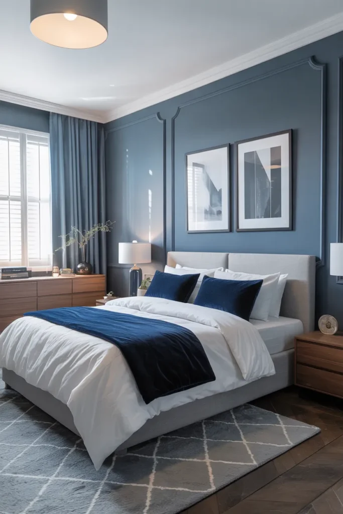
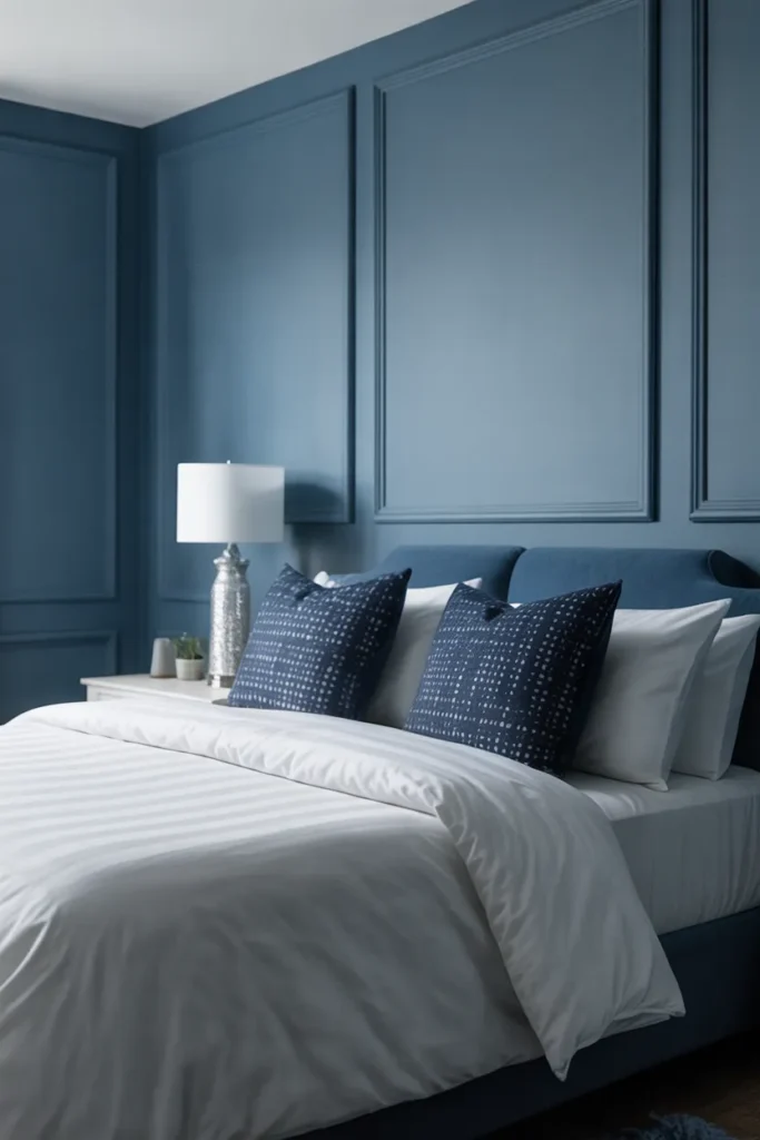
Muted Indigo Blue
- Brings a deep, introspective, and calm energy that is perfect for sleep.
- Offers a more interesting, personality-filled alternative to standard blue.
- Pairs perfectly with crisp white, cream, and metallic or wood accents.
- Creates a sophisticated, quiet space that promotes focus and mental clarity.
Muted indigo is a fantastic choice if you crave a bedroom that feels thoughtful, quiet, and distinct. This color is deeper and more complex than sky blue, providing a sense of introspection and calm that is excellent for winding down at night. In my experience, indigo creates a secure, boundary-filled environment that makes it easier to leave your work and worries behind. It is a sophisticated, mature color that feels very intentional, and when you pair it with the right textures, it transforms your bedroom into a deeply peaceful, restorative sanctuary.
When working with indigo, balance is essential to keep the room from feeling too dark or enclosed. Incorporating plenty of white or light-toned bedding provides a high-contrast brightness that keeps the overall vibe airy and clean. I’ve tried this approach, and it creates a beautifully balanced, modern aesthetic that feels very curated. By using warm, soft lighting, you can enhance the cozy side of this color, making it feel inviting and perfect for relaxing before bed. It is a bold, beautiful, and deeply relaxing choice that adds personality without sacrificing peace.
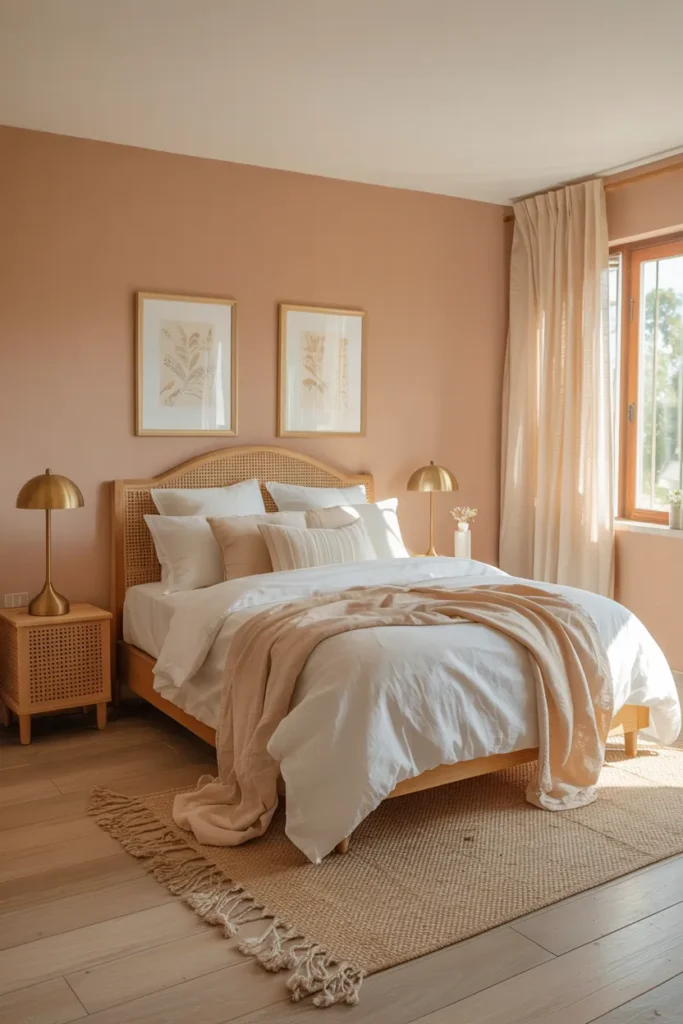
Soft Peach Glow
- Infuses the room with a subtle, healthy warmth that feels energizing.
- Creates a “glow” that makes the room feel instantly more welcoming.
- Pairs surprisingly well with cool blues or crisp whites for balance.
- Provides a softer, more subtle alternative to yellow or orange tones.
If you want a bedroom that feels naturally warm and welcoming, a soft peach glow is a wonderful, underrated choice. This color adds a healthy, gentle warmth to the walls that makes the room feel sun-drenched even when it is cloudy outside. In my experience, peach is incredibly flattering, creating an environment that feels optimistic, cozy, and inherently comfortable. It is an excellent option for those who want a peaceful bedroom that doesn’t feel “cold” or clinical, helping you feel immediately at ease the moment you step inside.
Styling a peach-colored room is fun because the color itself acts as a soft focal point. Keep the furniture light, such as white or light oak, to maintain that airy, relaxed vibe. I’ve seen this setup work beautifully because the lightness of the furniture prevents the peach from feeling too intense. Adding small, cool-toned accents like blue or silver can create a subtle, sophisticated balance. This keeps the room feeling fresh and modern while retaining that underlying warmth. It is a peaceful, happy, and unique choice that makes your bedroom feel like a comforting retreat.
Stone Gray Palette
- Offers a solid, grounded, and earthy neutrality that feels very calming.
- Brings the texture and color of natural stone indoors for a peaceful feel.
- Pairs exceptionally well with leather, wood, and metal elements.
- Creates a clean, distraction-free environment that is perfect for rest.
Stone gray is the ideal color for anyone looking to create a space that feels solid, reliable, and entirely grounded. Unlike lighter grays which can feel ephemeral, stone gray has a weight to it that makes a bedroom feel like a quiet, unshakable sanctuary. In my experience, this color is a favorite for those who value simplicity, order, and a distraction-free environment, as it allows your mind to settle quickly. It creates a seamless, peaceful backdrop that highlights your furniture and decor without competing for your attention, promoting deep, focused relaxation.
To bring out the best in stone gray, mix in natural materials like raw wood, leather, or linen to add tactile interest to the room. I’ve noticed that these textures warm up the cool tone of the gray, preventing the space from feeling clinical. This contrast creates a beautifully balanced look that feels sophisticated, natural, and incredibly cozy. By choosing this palette, you are building a bedroom that feels timeless and sturdy, providing a peaceful environment where you can disconnect from the busyness of your day and fully recharge your mind.
Creamy Oat Tones
- Provides a warm, wholesome, and natural neutral that is incredibly cozy.
- Creates a “neutral-on-neutral” look that is very trending and calming.
- Pairs perfectly with all wood tones, soft whites, and natural fibers.
- Offers a grounded, earthy alternative to sterile bright white walls.
Creamy oat tones bring an wholesome, earthy warmth to your bedroom that feels both cozy and incredibly sophisticated. This color is slightly deeper than white or beige, offering a rich, comforting quality that is perfect for a space dedicated to rest. In my experience, oat is the ultimate “peaceful” shade because it is completely non-threatening and visually soft, helping you feel instantly relaxed. It acts as a perfect canvas for layering different textures—like a fuzzy throw, linen sheets, or a woven rug—which creates a cozy, welcoming atmosphere that you will adore.
When you commit to a creamy oat palette, you want to lean into the “monochromatic” look to maximize the serene effect. Using different shades of off-white and beige throughout the room creates a peaceful, cohesive vibe that feels intentional and well-designed. I’ve tried this in several homes, and it consistently results in a bedroom that feels like a quiet, curated retreat. It is a versatile choice that adapts to any lighting condition, ensuring your room always feels warm, inviting, and perfectly balanced, making it one of the most reliable colors for a restful environment.
Dusty Periwinkle Blue
- Blends the calming nature of blue with the gentle warmth of purple.
- Offers a dreamy, ethereal, and sophisticated look for a peaceful bedroom.
- Pairs stunningly with crisp white, light gray, and soft silver accents.
- Creates a unique, personality-filled space that feels like a calm sky.
Dusty periwinkle blue is a beautiful, dreamy color that sits perfectly between blue and violet, making it a unique choice for a peaceful bedroom. This color feels ethereal and quiet, bringing a touch of romance and calm that is hard to find with standard blues. In my experience, periwinkle is a fantastic choice if you want a color that feels special and curated without being bold or jarring. It provides a soft, atmospheric quality that helps the room feel like a quiet, personal escape where you can comfortably disconnect from your day.
To style periwinkle effectively, keep the surrounding palette cool and neutral, using silver or crisp white to enhance its freshness. I’ve noticed that warm wood tones can sometimes clash with this shade, so sticking to light-colored or white furniture is usually the safer, more sophisticated bet. It is a stunning, calming color that makes your bedroom feel like a serene, private oasis. By focusing on soft, layered textiles, you create a space that feels deeply restorative and uniquely yours, allowing you to relax, unwind, and enjoy a peaceful night.
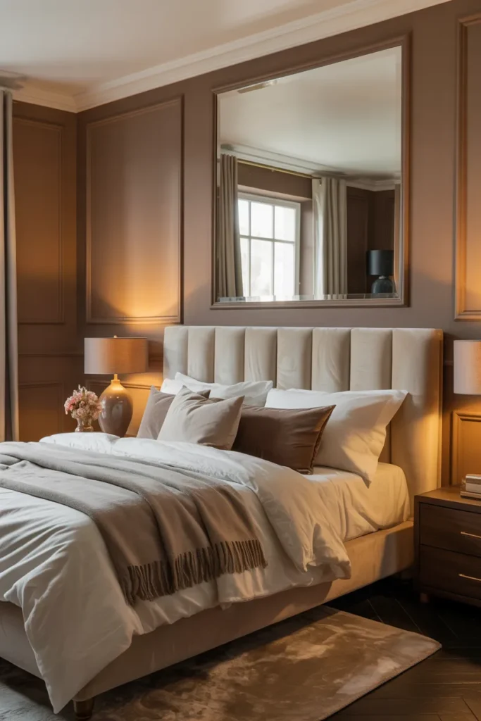
Soft Mocha Brown
- Adds a rich, grounding, and delicious warmth to your sleeping space.
- Creates a cozy, intimate “nest” that is perfect for curling up in.
- Pairs perfectly with cream, white, gold, and lighter wood tones.
- Offers a sophisticated, earthy alternative to grays or beiges.
Soft mocha brown is a rich, inviting color that makes your bedroom feel like the ultimate cozy, grounded nest. This shade is much warmer and more comforting than gray, providing a deep, delicious tone that envelops the room in warmth. In my experience, mocha brown is the perfect choice for creating an intimate, high-end look that feels remarkably peaceful. It takes the “coldness” out of a bedroom and replaces it with a steady, secure, and luxurious atmosphere that is absolutely perfect for relaxing at the end of a long, hectic day.
When you use a shade as rich as mocha, balance it with light, creamy linens to keep the room feeling fresh and open. I’ve seen this setup work beautifully because the contrast highlights the softness of the brown walls while keeping the room feeling airy. Adding metallic gold or brass accents can elevate the look, making the bedroom feel sophisticated, expensive, and intentional. It is a bold, cozy, and deeply relaxing choice that transforms your bedroom into a warm, inviting sanctuary you will adore coming home to every single evening.
Blushing Orchid Tones
- Brings a delicate, sophisticated, and romantic touch to a peaceful bedroom.
- Offers a soft, floral-inspired hue that is calming and unique.
- Pairs perfectly with light gray, cream, and touches of metallic silver.
- Creates a serene, graceful space that feels both modern and romantic.
Blushing orchid tones provide a delicate, graceful, and sophisticated update to a peaceful bedroom. This color is a muted, soft purple-pink that feels incredibly airy and refined, moving away from “trendy” colors and into something timeless. In my experience, orchid is perfect for those who want a serene environment that feels a bit more feminine and romantic without being overly bright or intense. It creates a calming, restful backdrop that looks beautiful in natural morning light, helping you wake up feeling refreshed, peaceful, and ready to start your day.
Styling with orchid requires a light hand; focus on pairing it with soft grays or creams to keep the space feeling balanced and modern. I’ve noticed that this color shines when paired with clean, simple furniture, as the walls already provide plenty of character. Adding subtle touches of silver or chrome can help cool down the sweetness of the orchid, giving the room a polished, designer-like finish. It is a fantastic, unique, and peaceful choice that turns your bedroom into a soft, romantic retreat that always feels clean, balanced, and perfectly restorative.
Conclusion
Creating a bedroom that truly feels like a sanctuary is within your reach, and I hope these suggestions inspire you to take that first step. I’ve seen how the right home decor can completely transform a space and how it feels, especially when you prioritize those soothing peaceful bedroom colors that invite relaxation. Don’t be afraid to experiment with paint swatches or new textures until you find what feels right for your home. Remember to save this post on Pinterest to keep these ideas handy for your next makeover. Try one of these styles, share it with a friend, and enjoy your new retreat!