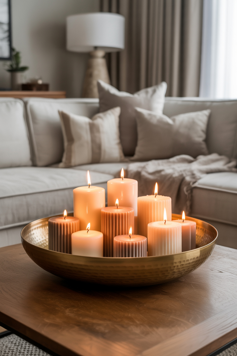
24 Super Chic Kitchen Color Scheme Ideas You’ll Love
Your kitchen is the beating heart of your home, yet finding the right look can feel overwhelming. If you are searching for fresh kitchen color scheme ideas that instantly elevate your space, you have arrived at the perfect place. In my experience, choosing the right paint and material palette changes not just how a room looks, but how it feels every single day. Whether you want to turn a compact apartment kitchen into a bright, airy sanctuary or infuse rich, moody sophistication into an open-concept layout, the right design choices make all the difference. I’ve noticed how a simple color shift can entirely revive tired cabinetry and revitalize your entire routine. Dive into these inspiring concepts, discover your dream aesthetic, and get ready to create a home you adore.
Sage Green and Warm Oak
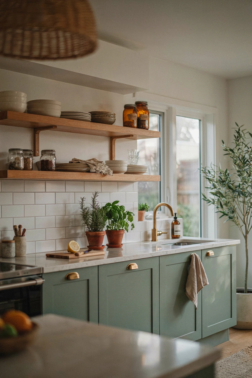
- Creates an earthy, grounded feel that connects your cooking space with nature.
- Softens hard surfaces like quartz and marble through warm, textured wood tones.
- Brightens dark corners without relying on clinical, stark white paint shades.
- Pairs effortlessly with brass, black, or chrome fixtures for flexible styling.
Bringing earthy elements into the heart of your home creates an immediate sense of calm and visual harmony. Sage green provides a subtle pop of color that feels timeless rather than trend-driven, making it ideal for cabinetry. When paired with natural warm oak accents, the space shifts from sterile to deeply inviting. In my experience, this pairing excels in smaller layouts because the soft green reflects natural light while the wood adds essential weight and grounding. You instantly get an organic, high-end feel that transforms daily cooking into a far more serene daily routine.
Styling this palette requires very little extra decor because the finishes themselves carry the design. Choose brushed brass hardware to complement the warm undertones in the oak, or select matte black pull handles for a crisp modern edge. Seamless quartz countertops keep the overall aesthetic clean and uncluttered, allowing open shelving to showcase textured ceramics or glass jars. I’ve noticed that adding potted indoor herbs or trailing greenery reinforces the botanical theme effortlessly. Whether updating a cozy apartment room or a spacious layout, this combination balances relaxed charm with elevated modern interior design sophistication.
Warm Terracotta and Cream
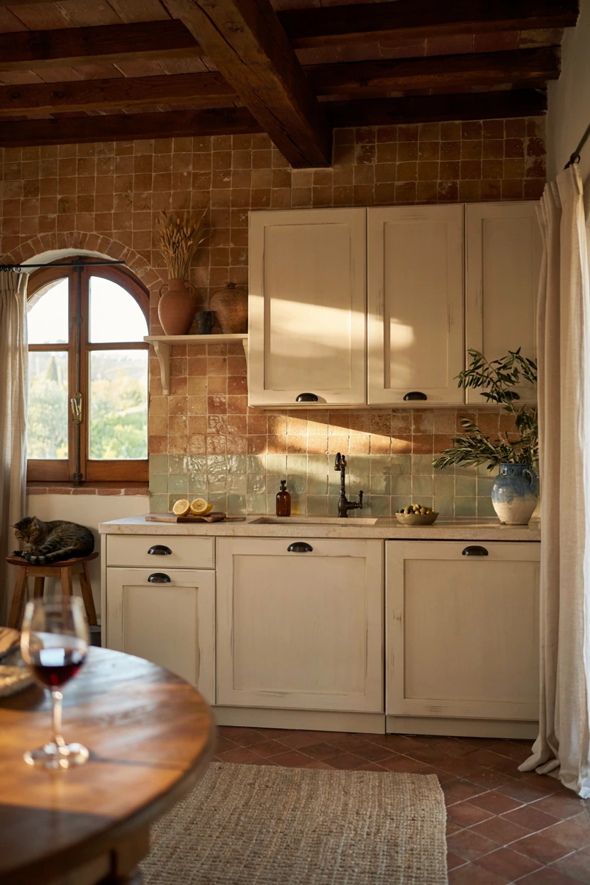
- Infuses instant architectural warmth into modern or builder-grade spaces.
- Softens harsh natural light with rich, earthy, Mediterranean-inspired wall undertones.
- Complements natural wood furniture, woven basketware, and handmade ceramic dinnerware seamlessly.
- Creates a cozy, artisanal environment that feels inviting year-round.
Infusing rich Mediterranean warmth into your cooking zone completely alters how light moves throughout the room. Terracotta offers an earthy, grounded quality that instantly replaces cold, sterile undertones with welcoming comfort. Pairing this sun-drenched shade with creamy off-white cabinetry prevents the space from feeling heavy or overly enclosed. That’s why many interior designers recommend using matte finishes on terracotta tiles or plastered walls to maintain a soft, tactile surface. This color strategy works exceptionally well in homes with abundant natural light, transforming ordinary cooking areas into cozy gathering spaces where family members naturally want to linger.
Balancing deep clay tones requires deliberate material choices across your countertops and architectural trim details. Cream-colored zellige tiles make an outstanding backsplash because their hand-cut surfaces bounce light unevenly across the warm backdrop. Introduce rustic timber ceiling beams or exposed oak shelving to reinforce the artisanal texture without cluttering your counters. Woven pendant light fixtures and aged brass hardware harmonize seamlessly with terracotta undertones, creating a layered look. Exploring thoughtful kitchen color scheme ideas like this allows you to create a high-end customized kitchen aesthetic that feels genuinely lived-in, stylish, and full of timeless personal character.
Moody Navy and Marble
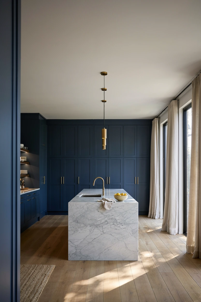
- Delivers striking dramatic contrast while keeping surfaces bright and reflective.
- Hides scuffs and fingerprints on lower cabinets better than light-colored finishes.
- Elevates standard cabinet profiles into sophisticated custom-looking furniture pieces.
- Pairs effortlessly with polished brass, champagne bronze, or chrome hardware finishes.
Deep navy cabinetry paired with luminous white marble creates an iconic visual contrast that never loses its allure. Dark blues ground the lower space, anchored by rich undertones that feel substantial, sophisticated, and tailored. When balanced with heavily veined marble island counters and splash panels, the dramatic navy paint never overwhelms the room. I’ve seen this setup work beautifully in narrow kitchens because the white stone bounces ambient lighting across the ceiling while dark cabinets draw the eye downward. The result is a refined balance between dramatic moodiness and crisp, bright architectural functionality.
To maximize this striking palette without making your layout feel heavy, focus on warm metallic details and glass accents. Brushed gold or champagne brass drawer pulls act like fine jewelry against deep blue painted doors. Open glass-front upper cabinets prevent upper wall space from feeling boxed in, allowing decorative glassware to catch the light. Adding light-toned hardwood flooring or soft neutral runner rugs creates a necessary warm buffer between the cabinetry and floor. This rich combination gives your home a polished executive feel, transforming basic suburban layouts into sleek modern culinary showpieces.
Warm Greige and Brass
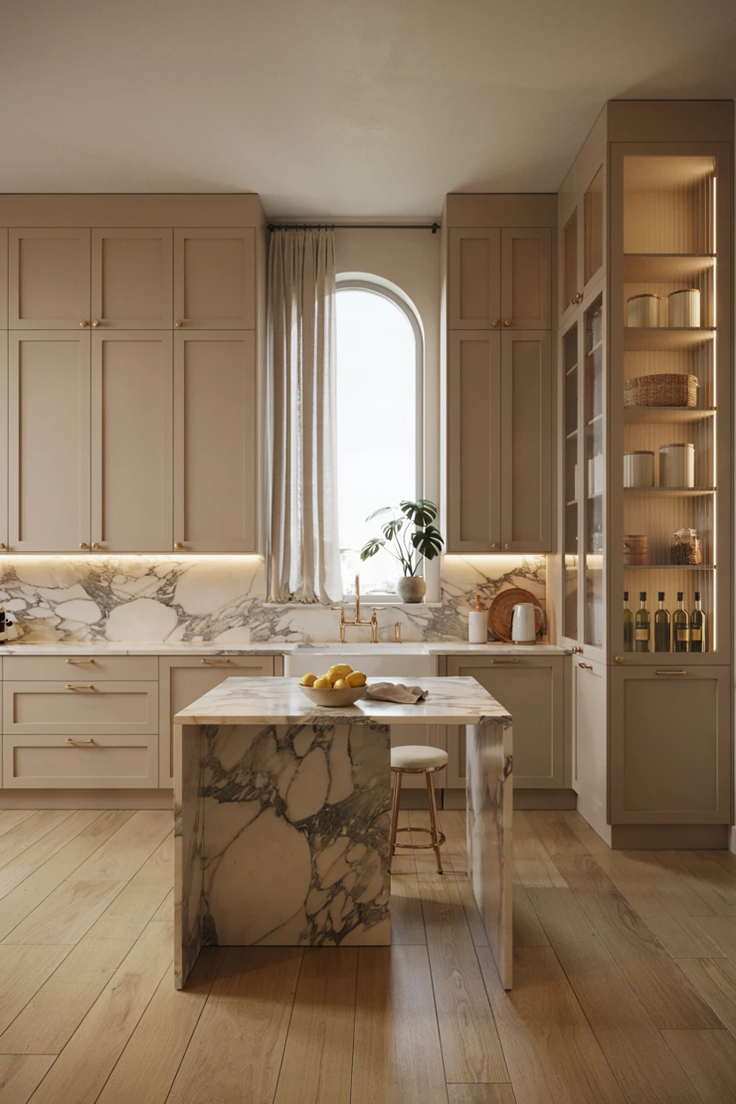
- Blends gray’s sophistication with beige’s warmth for a versatile neutral backdrop.
- Prevents monochromatic kitchens from feeling flat or clinical under cold light.
- Adapts seamlessly to changing decor accessories, seasonally or over time.
- Enhances resale value with an universally appealing, high-end transitional color base.
Finding the ideal balance between cool gray and cozy beige unlocks incredible versatility for your main living zones. Greige serves as a quiet chameleon, shifting subtly throughout the day depending on incoming sunlight levels. Unlike stark white paint, this subtle undertone softens surrounding architecture while providing enough contrast against light countertops. In my experience, choosing greige for whole-kitchen cabinet setups creates an airy, expansive feeling that works brilliantly in open-concept layouts. It bridges traditional styling and modern minimalist preferences, giving you a timeless foundation that never feels dated, sterile, or overly restrictive.
Elevating a greige color palette relies heavily on introducing luminous metal accents and varied material textures throughout the room. Satin brass cabinet handles, warm copper pendant lights, and brushed gold fixtures bring out the subtle yellow and pink undertones in greige paint. Consider installing ribbed glass cabinet doors or a micro-mosaic backsplash to build depth across flat surfaces without cluttering your counters. Adding warm wooden cutting boards and ceramic dishware keeps the environment grounded. This elegant color treatment yields a serene, upscale kitchen environment that seamlessly coordinates with adjacent dining or living areas.
Matte Black and Walnut
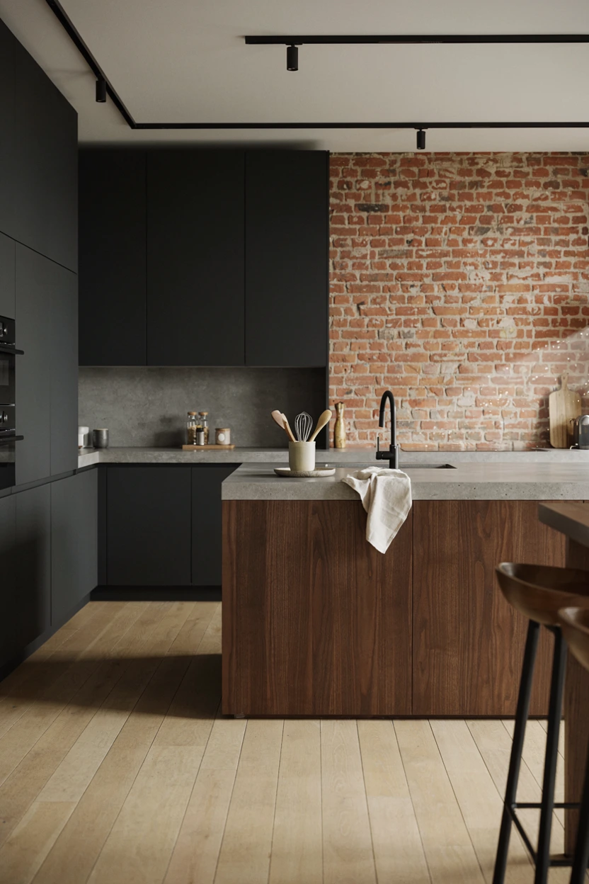
- Imparts a modern, architectural, high-end designer statement in any home.
- Softens bold dark cabinets through the organic, rich grain of natural walnut.
- Reduces visible smudges when using anti-fingerprint matte cabinet coatings.
- Integrates integrated black appliances seamlessly into sleek cabinetry runs.
Designing with dark tones creates an instant feeling of modern architectural luxury when balanced correctly with natural textures. Matte black cabinetry establishes crisp lines and quiet intensity, forming a stunning backdrop for food prep and entertaining. Combining this dramatic finish with deep walnut cabinetry or island paneling prevents the kitchen from feeling cold or commercial. I’ve noticed that rich wood grains absorb light differently than painted panels, softening sharp corners and adding tactile warmth. This bold combination suits open urban lofts and spacious contemporary homes, making a confident design statement that immediately commands visual attention.
Sustaining harmony within a dark color scheme requires thoughtful lighting placement and tactical surface choices. Concrete-look countertops or honed black granite create subtle tactile variation, while sleek under-cabinet ambient strip lighting ensures work areas remain bright. Incorporating open walnut floating shelves breaks up solid walls of black upper cabinets, offering space to display neutral pottery or glassware. Black hardware creates a streamlined handleless look, whereas brushed smoked bronze accents add subtle metallic shimmer. By thoughtfully balancing light reflections with deep shadows, this modern aesthetic delivers an ultra-stylish, lounge-like kitchen environment that feels curated, refined, and effortlessly cool.
Soft Blush and Warm Cream
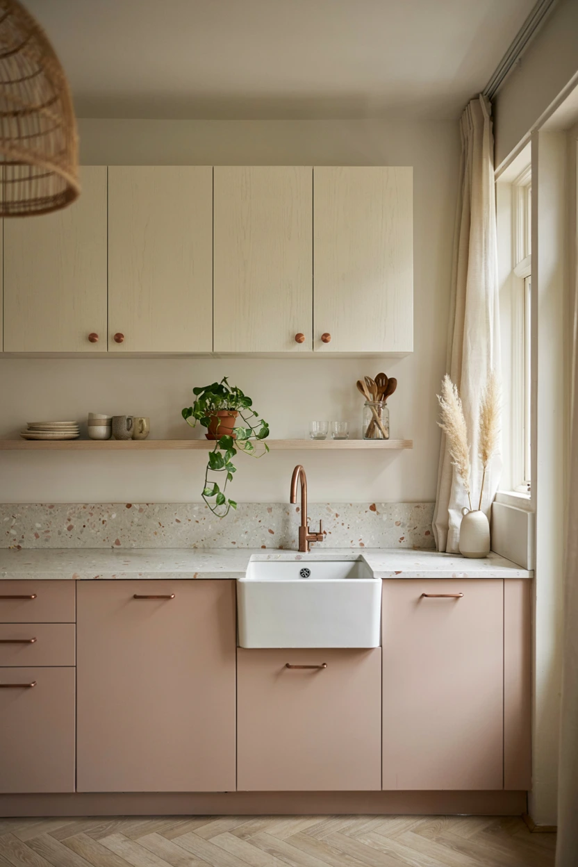
- Adds subtle warmth and playful elegance without feeling overly sweet or pink.
- Bounces daylight across smaller rooms, making compact spaces feel larger.
- Coordinates effortlessly with light ash wood, copper details, and white stone.
- Delivers an understated alternative to conventional neutral kitchen paint choices.
Subtle pink undertones offer a surprisingly sophisticated alternative to standard neutral paints when designed with restraint. Soft dusty blush brings gentle warmth into the room, instantly making hard surfaces like tile and stone feel more approachable and inviting. When paired with rich cream walls or upper cabinets, the blush shade functions as an elegant neutral rather than a loud accent color. That’s why many interior designers recommend keeping the pink tones muted with grey undertones to maintain a mature look. It works beautifully in sunlit kitchens, infusing light-filled spaces with soft rosy warmth throughout the day.
Completing this romantic palette requires introducing natural materials that anchor the soft color scheme. Terrazzo countertops containing warm flecks of rose, cream, and beige complement dusty blush cabinetry while introducing playful texture. Light ash or white oak floating shelves keep wall space feeling open, offering perfect spots for displaying ceramic tea sets or cookbook collections. Warm copper or satin brass cabinet pulls harmonize with rosy undertones, creating a cohesive metallic polish. Incorporating versatile kitchen color scheme ideas like this allows small apartments or cozy breakfast nooks to feel expansive, cheerful, and full of personality.
Read More: 24 Stunning Summer Dinner Party Tablescape Designs
Dusty Blue and White
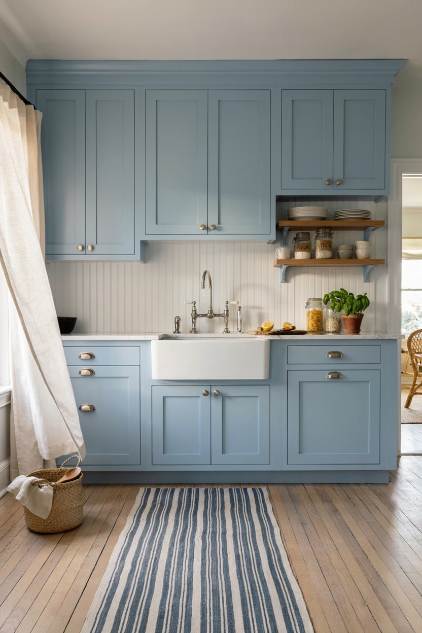
- Creates a tranquil, serene atmosphere perfect for busy family cooking areas.
- Reflects daylight beautifully to expand compact or low-ceiling room proportions.
- Bridges traditional coastal appeal with crisp modern architectural sensibilities effortlessly.
- Enhances polished chrome, brushed nickel, or stainless steel appliances cleanly.
Invoking gentle coastal vibes through soft dusty blue cabinetry brings a serene atmosphere into your central living zone. The muted undertones keep blue paint from feeling overwhelming, providing just enough color depth to make white walls pop. When combined with crisp white quartz counters, the room instantly opens up, absorbing sunlight and scattering light across nearby walls. In my experience, dusty blue works wonders in homes with smaller windows because it prevents shadows from appearing overly dark or gloomy. You get an effortless, airy aesthetic that feels clean, fresh, and exceptionally soothing.
Styling this ocean-inspired palette calls for classic material pairings that maintain light visual balance across all surfaces. White beadboard backsplash panels add subtle linear texture without cluttering your walls, while polished chrome fixtures catch the light beautifully. Consider bringing in light pine or natural rattan dining chairs to ground the soft blue tones with subtle organic warmth. Glass pendant lamps above an island keep sightlines completely clear, maximizing spatial flow across open floor plans. This soothing combination transforms everyday cooking zones into peaceful retreats that feel bright, breezy, and effortlessly organized every single day.
Rich Olive and Brass
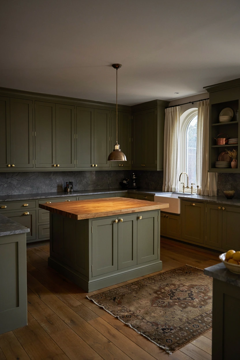
- Imparts a historic, grounded grandeur that feels rich, mature, and cozy.
- Masks kitchen splatters and wear on high-use cabinetry surfaces effectively.
- Complements natural wood grains, butcher block, and natural stone tops effortlessly.
- Enhances aged metallic hardware like unlacquered brass and dark copper fixtures.
Deep olive green cabinetry introduces an earthy sophistication that feels deeply rooted in traditional European countryside design. Rich yellow-green undertones give olive a complex warmth that shifts delightfully throughout the day under changing lighting conditions. Pairing dark olive with unlacquered brass hardware creates an instant heirloom quality, as the metal ages gracefully beside the deep paint. That’s why many interior designers recommend olive for historic home restorations or rustic modern conversions. It offers a cozy, grounded sanctuary vibe that makes late-night cooking and morning coffee routines feel exceptionally warm, inviting, and quiet.
Balancing dense olive tones requires mixing diverse surface textures to prevent the room from appearing overly shadowy. A solid oak butcher block island top adds organic texture, while perimeter soapstone counters provide dark, elegant contrast. Incorporate vintage runners or woven jute rugs to soften tiled floors and tie together earthy wall paint selections. Open shelving displaying copper cookware or cream ceramic serveware breaks up long runs of upper cabinets smoothly. This mature color strategy yields a deeply comforting culinary space that feels timeless, artfully curated, and filled with old-world architectural charm.
Warm Mustard and Slate
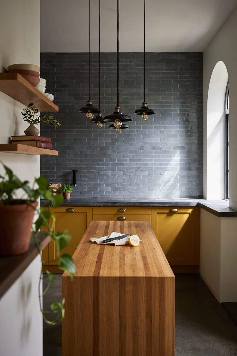
- Delivers an energetic, creative pop of color without feeling overly primary.
- Pairs brilliantly with cool slate gray, dark concrete, and industrial metals.
- Stimulates natural light in windowless spaces or north-facing apartment kitchens.
- Masks heavy kitchen traffic through durable, warm, saturated lower color finishes.
Bringing vibrant mustard yellow into your home injects immediate personality and radiant energy into your daily routine. Saturated golden tones act as an instant mood booster, bringing warm sunlight indoors even on overcast winter days. Pairing rich mustard lower cabinets with dark slate gray walls creates a dramatic, modern contrast that balances playfulness with edgy sophistication. In my experience, using mustard exclusively on base cabinets keeps the bold hue grounded beneath eye level. This prevents visual fatigue while creating an exciting, highly memorable design focal point that guests will instantly love.
Harmonizing bright golden shades with dark slate elements relies on industrial textures and warm timber balancing details. Concrete-look countertops and dark gray tile backsplashes absorb intense reflection, allowing the yellow cabinet fronts to shine as true art pieces. Install matte black industrial pendant lights or exposed metal shelving to reinforce an urban, artistic vibe throughout the layout. Adding natural oak cutting boards and black iron bar stools grounds the saturated paint choices effortlessly. This dynamic setup creates a stylish, high-contrast environment perfect for adventurous homeowners seeking creative, energetic kitchen styling ideas.
Charcoal and Light Oak
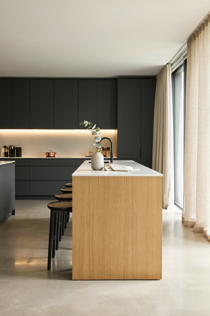
- Provides a sleek, high-contrast modern look that feels warm rather than clinical.
- Softens dramatic dark charcoal surfaces through pale oak wood grain panels.
- Hides daily kitchen wear while maintaining an ultra-clean visual presentation.
- Complements integrated architectural lighting, flush paneling, and hidden storage options.
Charcoal gray combined with pale oak creates a refined Scandinavian modern look that balances intensity with organic warmth. Deep matte charcoal cabinets anchor the perimeter walls, providing architectural structure without the intense starkness of solid black paint. Interruption from light oak island paneling introduces natural grain patterns that instantly soften dark surrounding surfaces. I’ve noticed this combination works exceptionally well in open-plan apartments because it clearly defines the cooking zone while harmonizing with adjacent living room furniture. The resulting environment feels sleek, calm, and tailored for modern urban living.
Executing this modern aesthetic requires keeping surfaces completely uncluttered and focusing on clean architectural lines. White solid-surface or quartz countertops maintain a crisp light plane that reflects natural illumination across the dark cabinet fronts. Opt for integrated handle cutouts or minimal black hardware to preserve clean, uninterrupted cabinet elevations. Recessed ambient lighting strip channels beneath upper cabinets cast a warm glow over natural wood backsplashes or floating shelves. This clean design approach creates an upscale, low-maintenance cooking space that emphasizes spatial order, luxury, and contemporary functional elegance.
Crisp White and Gold
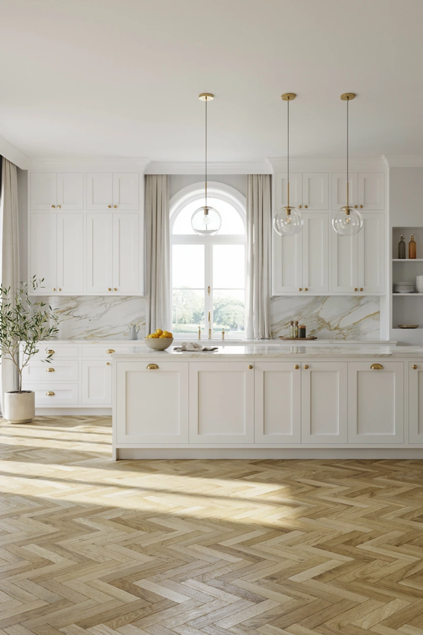
- Maximizes light reflection to make any kitchen feel twice its actual size.
- Delivers an enduring, high-resale investment look that never goes out of style.
- Elevates simple white cabinet profiles with glamorous, glowing metallic hardware accents.
- Pairs seamlessly with any seasonal decor, colorful dishware, or fresh florals.
Classic white cabinetry paired with glowing gold hardware remains the ultimate benchmark for timeless kitchen elegance. Crisp white surfaces maximize ambient light distribution, making tight floor plans feel spacious, open, and pristine. Introducing polished gold or brass drawer pulls and faucets elevates simple door profiles into high-end luxury statements. That’s why many interior designers recommend this classic combination for homeowners seeking long-term investment value. The clean white backdrop serves as a fresh canvas that easily adapts to shifting accent colors, seasonal decor updates, or evolving styling preferences over time.
Refining a monochromatic white space demands attention to fine surface textures and metallic coordination across all details. Calacatta marble backsplashes featuring delicate gold or gray veining tie the cabinet paint and metallic hardware together seamlessly. Laying light oak flooring in a classic herringbone pattern adds subtle geometric texture underfoot, preventing the white room from feeling clinical. Hang clear glass pendant lights with brass fittings above the island to preserve open sightlines. This luminous combination yields a bright, majestic cooking environment that always feels welcoming, impeccably detailed, and utterly luxurious.
Read More: 25 Stunning Powder Room Inspirations with White Vanities Arb
Soft Taupe and Bronze
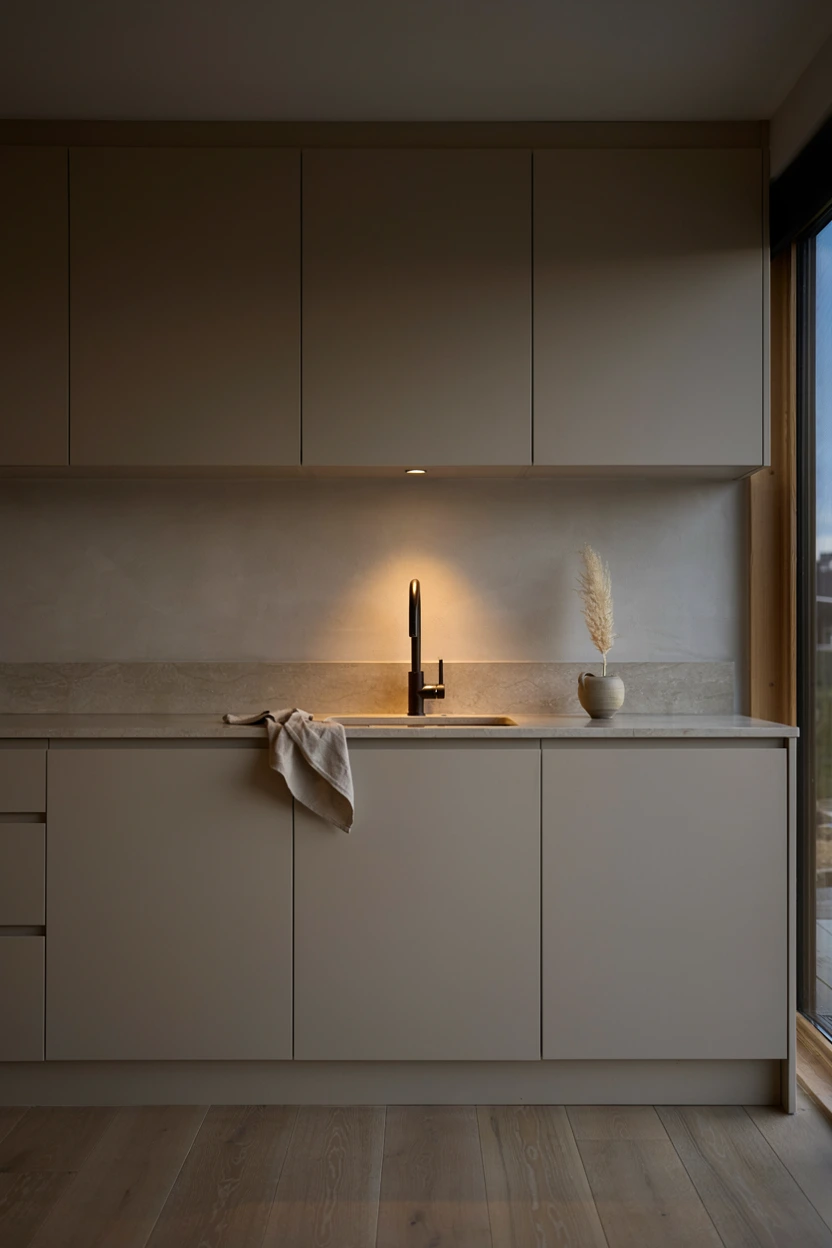
- Bridges gray and brown tones to create a deeply soothing, organic neutral base.
- Anchors minimalist spaces without feeling cold, stark, or overly stark white.
- Pairs exceptionally well with natural stone, limestone, concrete, and bronze finishes.
- Shows far less daily dust, smudges, and wear than stark white cabinet doors.
Embracing soft taupe creates a serene, grounded atmosphere that radiates quiet luxury and minimalist elegance. Taupe combines grey’s sophisticated neutrality with brown’s cozy warmth, forming a flexible base color that adjusts nicely under variable lighting. Pairing flat-panel taupe cabinetry with dark oil-rubbed bronze fixtures establishes a subtle, grounding contrast that feels completely organic. In my experience, taupe works exceptionally well in Japanese-inspired or organic minimalist homes where natural materials take center stage. You achieve a tranquil, quiet space that feels warm, intentional, and deeply comforting to live in everyday.
Bringing depth into a taupe kitchen relies on tactile natural materials rather than high-contrast paint colors. Install beige limestone or honed granite countertops alongside a smooth micro-cement backsplash to create soft, touchable surfaces. Bronze cabinet handles and sleek dark faucets anchor the muted cabinetry, adding defined structural lines throughout the room. Keep styling minimal by displaying hand-thrown ceramic bowls, dark wooden boards, or single branch arrangements on floating shelves. This thoughtful approach creates a calm, spa-like kitchen retreat that shields you from the chaotic pace of everyday life.
Read More: 24 Living Room Pillow Ideas That Look So Expensive!
Deep Emerald and Gold
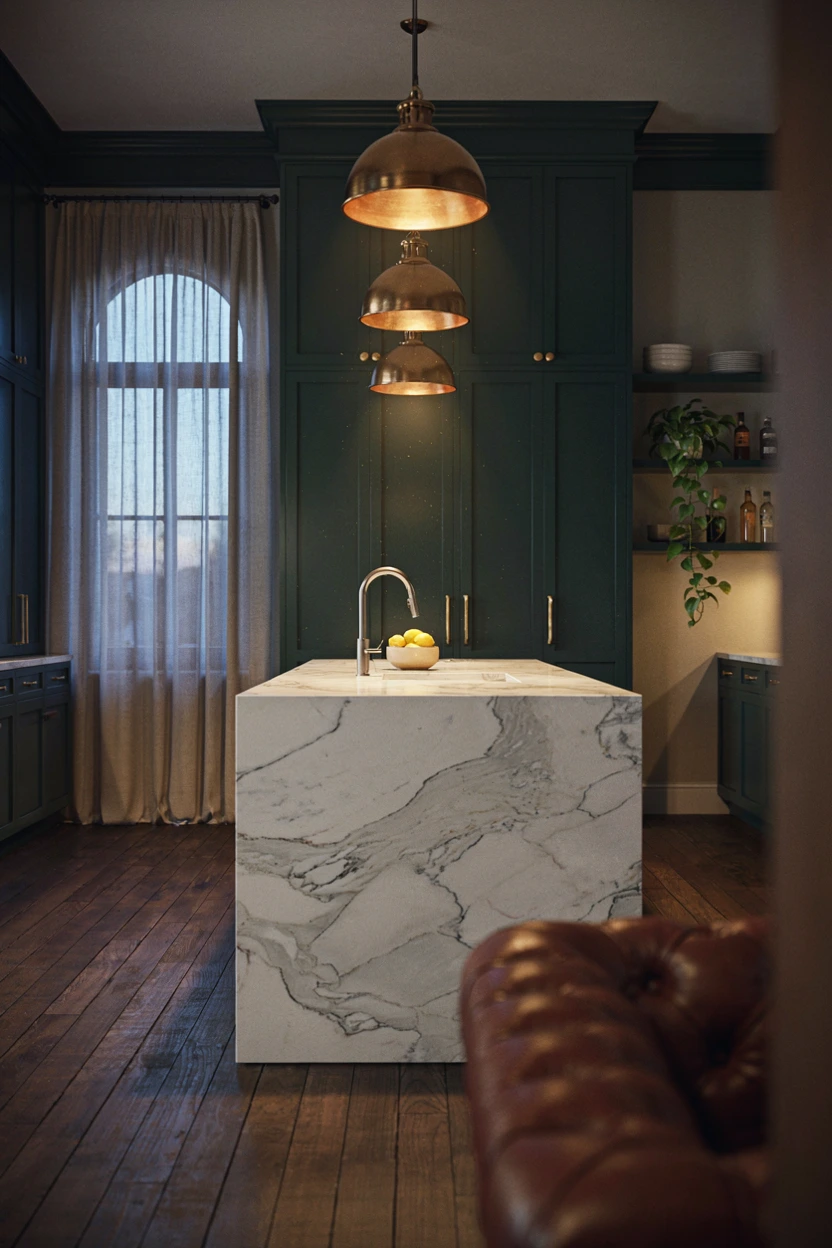
- Delivers an opulent, jewel-toned statement that exudes dramatic luxury style.
- Anchors large kitchen spaces and high-ceiling rooms with dark, confident color.
- Pairs magnificently with bright white marble and warm polished gold accents.
- Hides baseboard scuffs and heavy family kitchen traffic wear effortlessly.
Rich emerald green cabinetry brings breathtaking jewel-toned luxury into your home, creating a space that feels bold and tailored. Deep green hues invoke lush natural foliage, introducing a fresh yet undeniably dramatic mood into the kitchen. Pairing emerald green with polished gold fixtures produces an opulent contrast reminiscent of high-end boutique hotels. That’s why many interior designers recommend emerald green for kitchen islands or bar nooks when clients want maximum visual impact. It transforms mundane daily food preparation into a truly special, luxurious domestic experience.
Taming intense emerald paint calls for bright reflective surfaces and natural wood elements that keep the layout grounded. A thick white marble waterfall island provides crucial visual relief, bouncing overhead light across dark cabinet fronts. Deep oak or walnut hardwood flooring adds rich warmth beneath, preventing the green paint from feeling overly cold or theatrical. Select sleek gold wire pendant lights or champagne brass hardware to complete the jeweled aesthetic cleanly. This confident design strategy results in a sensational, magazine-worthy kitchen that serves as an incredible backdrop for evening entertaining.
Creamy Latte and Marble
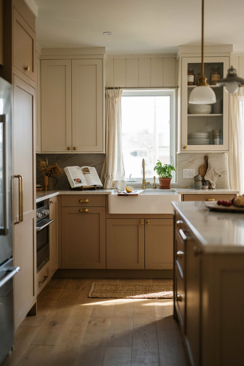
- Infuses cozy café-inspired warmth into everyday kitchen and dining spaces.
- Softens strong daylight without making small kitchens feel dark or cramped.
- Bridges white upper walls with darker flooring options seamlessly and comfortably.
- Coordinates beautifully with warm brass, copper, or antique bronze hardware finishes.
Warm latte tones offer a comforting, coffee-inspired palette that brings immediate cozy charm into the culinary home. Soft warm brown cabinetry grounds the room with earthy stability while feeling significantly softer than deep chocolate or dark black. Pairing latte lower cabinets with off-white upper cabinets keeps higher wall areas light, airy, and expansive. In my experience, this two-tone strategy works wonders in average-sized kitchens, offering rich color depth without sacrificing natural light. It builds a cozy, welcoming atmosphere that makes morning breakfast routines feel like sitting in your favorite coffee shop.
Enhancing a latte-inspired palette requires incorporating soft stone veining and warm metallic accents throughout the layout. Cream marble countertops with delicate tan or gold veining tie upper and lower cabinet paint colors together beautifully. Brass or brushed copper hardware highlights the warm undertones in latte paint, adding subtle shine across drawer fronts. Lay light oak wood flooring to maintain visual continuity from the kitchen into adjoining dining or living spaces. This inviting design approach builds a comforting, stylish heart of the home where guests naturally gather, chat, and feel right at home.
Dusty Rose and Charcoal
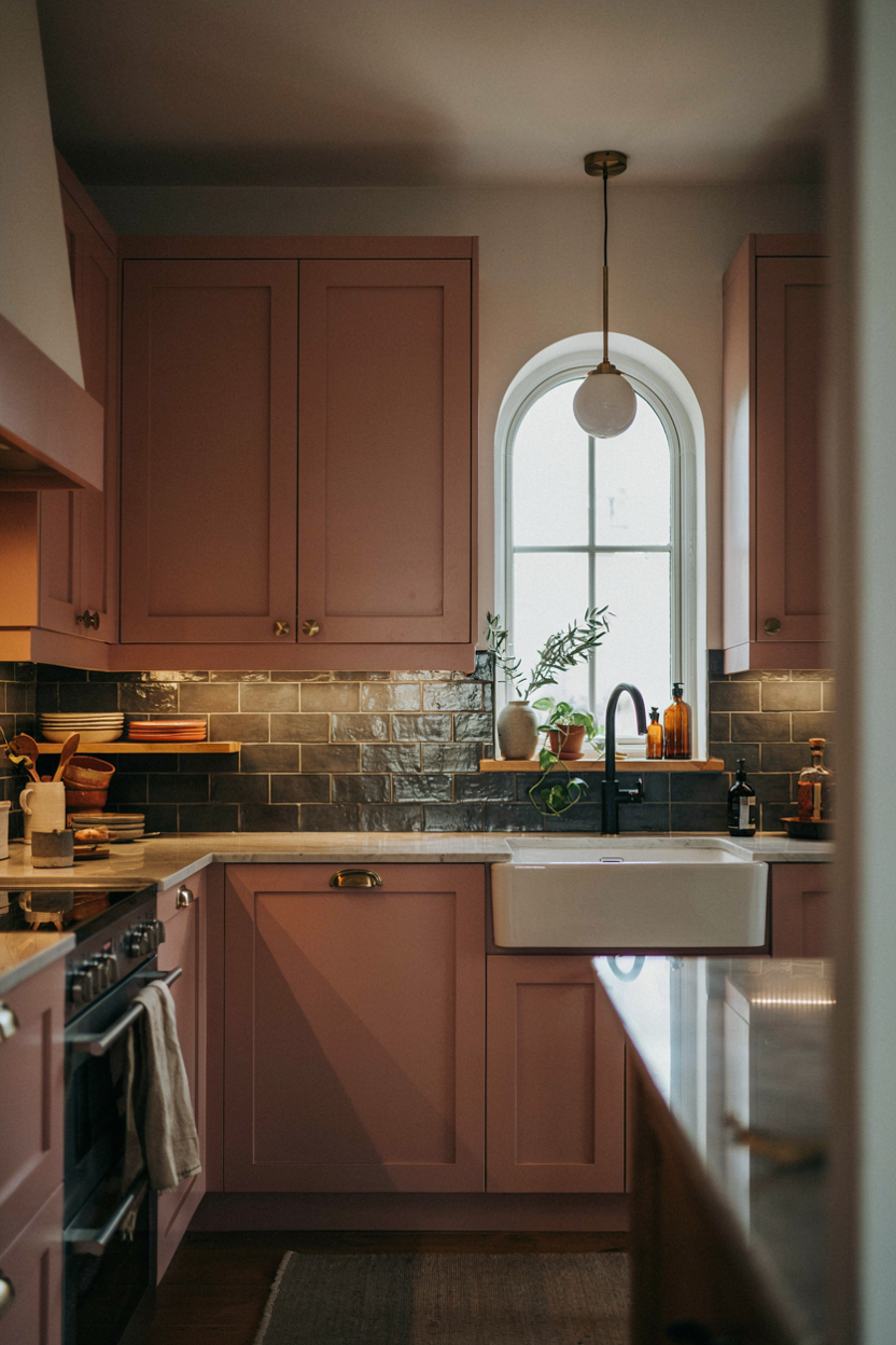
- Delivers a sophisticated, unconventional color pairing full of modern personality.
- Softens dramatic charcoal tiles with gentle, dusty pink cabinet undertones.
- Suits modern city apartments, creative studio kitchens, and trendy homes.
- Hides upper wall shadows while keeping work surfaces stylish and defined.
Pairing dusty rose cabinets with dramatic charcoal backsplashes creates an unexpected, deeply romantic contrast loaded with modern editorial flair. Muted pink brings a soft, sophisticated warmth that feels creative and refined rather than sweet or juvenile. Charcoal gray elements anchor the rosy paint, introducing moody modern depth that grounds the entire room. I’ve seen this setup work beautifully in urban loft spaces where owners want to break away from traditional white or grey kitchen templates. The result is a highly personalized, artistic room that feels incredibly chic and modern.
Sustaining visual balance across this eclectic scheme requires careful coordination of surface textures and hardware details. Honed grey quartzite or slate countertops bridge the gap between pale pink doors and dark grey wall tiles seamlessly. Choose matte black hardware and faucets to define sharp, modern structural lines against the soft cabinet fronts. Under-cabinet warm LED lighting illuminates the dark splash tiles, casting a cozy glow across workspace zones. This creative design strategy yields a stunning, Instagram-worthy kitchen that effortlessly demonstrates your confident personal style and design courage.
Warm Caramel and Cream
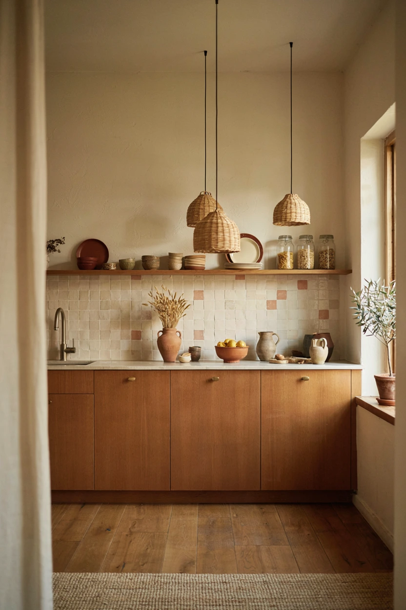
- Infuses organic, leather-toned warmth into modern or bohemian kitchen interiors.
- Enhances natural light with soft, golden undertones that feel cozy year-round.
- Pairs seamlessly with woven rattan, terracotta pots, and natural linen textures.
- Provides a rich alternative to traditional wood stains and standard beige paints.
Rich caramel undertones bring a buttery, leather-like warmth into the kitchen that instantly lifts the spirit. Stained or painted caramel cabinetry radiates golden sunlight, making hard kitchen surfaces feel deeply comforting, organic, and inviting. When paired with soft off-white walls, caramel cabinets stand out as cozy, glowing furniture pieces rather than simple functional storage units. That’s why many interior designers recommend caramel tones for sunroom kitchens or open-concept homes where organic textures shine. It offers a warm, boho-chic environment that feels naturally stylish and full of authentic personality.
Styling caramel cabinetry relies on introducing tactile earth-drawn accessories and natural fiber textiles throughout the layout. Creamy zellige backsplashes bounce light gently, highlighting the subtle golden variations in caramel wood stains or paint finishes. Rattan pendant lights and terracotta planter pots reinforce the grounded, organic aesthetic without cluttering counter surfaces. Opt for simple antiqued brass hardware to maintain a soft, warm metallic finish that complements the golden cabinet tones. This inviting color strategy creates a relaxed, sun-drenched sanctuary where daily meal prep feels effortless, joyful, and calm.
Cool Slate and Steel
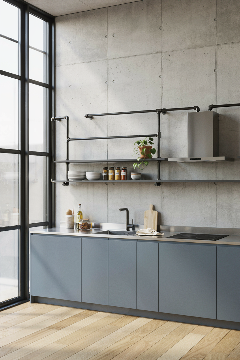
- Delivers a crisp, chef-inspired commercial kitchen aesthetic for home cooks.
- Reflects daylight sharply across stainless steel and slate blue cabinet surfaces.
- Resists kitchen stains, heat damage, and daily wear exceptionally well.
- Integrates professional stainless steel appliances and heavy-duty cookware seamlessly.
Cool slate blue paired with professional stainless steel creates an sleek, chef-inspired workspace built for serious cooking. Slate gray-blue paint delivers a calm, collected color base that feels orderly, clean, and highly sophisticated. Combining this cool undertone with reflective stainless steel countertops and industrial metal accents brings a restaurant-grade edge into residential spaces. In my experience, this setup appeals strongly to passionate home chefs who want commercial functionality wrapped in sleek architectural design. The result is a sharp, efficient room that feels bright, clean, and completely professional.
Maintaining comfort within an industrial cool slate scheme calls for strategic introduction of subtle warm elements. Concrete backsplashes or light grey quartz perimeter surfaces maintain the architectural grey theme while adding interesting tactile variations. Open black metal pipe shelving allows bright copper pans or wooden cutting boards to add necessary pops of functional color. Integrated sleek cabinet handles keep sightlines continuous, preserving a streamlined look across all cabinet runs. This modern approach delivers a cool, high-performance culinary environment that looks like a high-end architectural showroom.
Read More: 25 Chic Summer Porch Ideas You Will Totally Love
Soft Mint and Terracotta
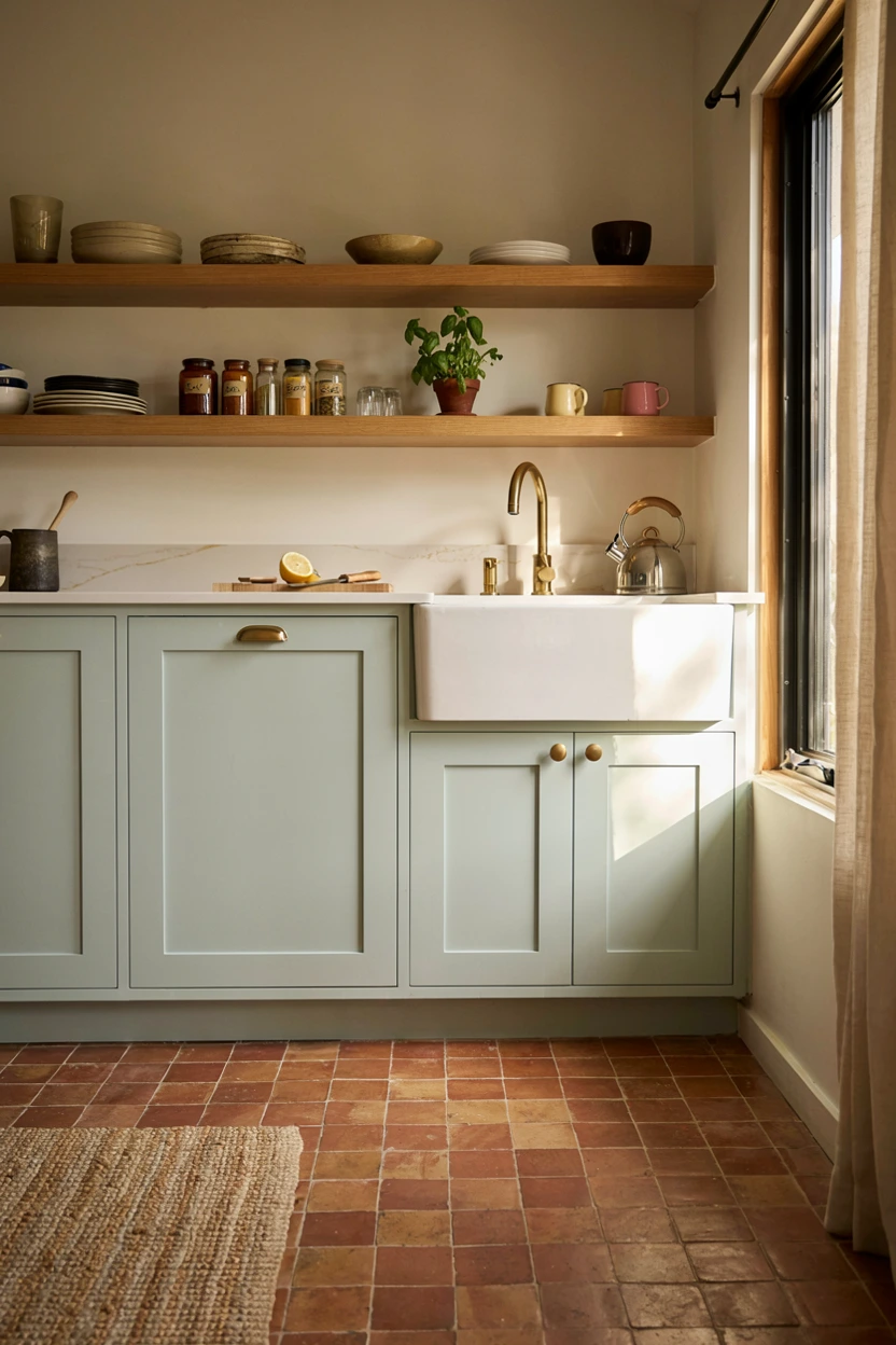
- Injects a cheerful, retro-modern pop of fresh spring color into any home layout.
- Pairs cool, refreshing mint green cabinets against warm terracotta floor tiles.
- Expands small cottage or apartment kitchens through light-reflecting pastel tones.
- Coordinates delightfully with light wood open shelving and white quartz surfaces.
Soft mint green paired with earthy terracotta floor tiles offers a refreshing, playful color combination full of vintage charm. Light mint paint brings an airy, cool freshness into the room that instantly brightens up dark corners and tight layouts. The warm clay tones of terracotta flooring provide an organic anchor, preventing pastel green from feeling cold or washed out. That’s why many interior designers recommend this combination for cottage restorations or sunlit breakfast nooks. It builds a playful, happy atmosphere where morning routines feel bright and energizing every day.
Completing this cheerful color scheme requires keeping upper wall surfaces light, airy, and uncluttered. White quartz countertops with subtle wood grain butcher block island inserts bridge cool green paint with warm floor tiles. Open oak floating shelves offer perfect display areas for white ceramic mugs, clear glassware, or trailing green houseplants. White or brushed nickel cabinet pulls keep the look clean, modern, and uncluttered. This joyful color strategy transforms standard kitchens into bright, vintage-inspired sanctuaries that bring daily smiles to everyone who enters.
Deep Plum and Gold
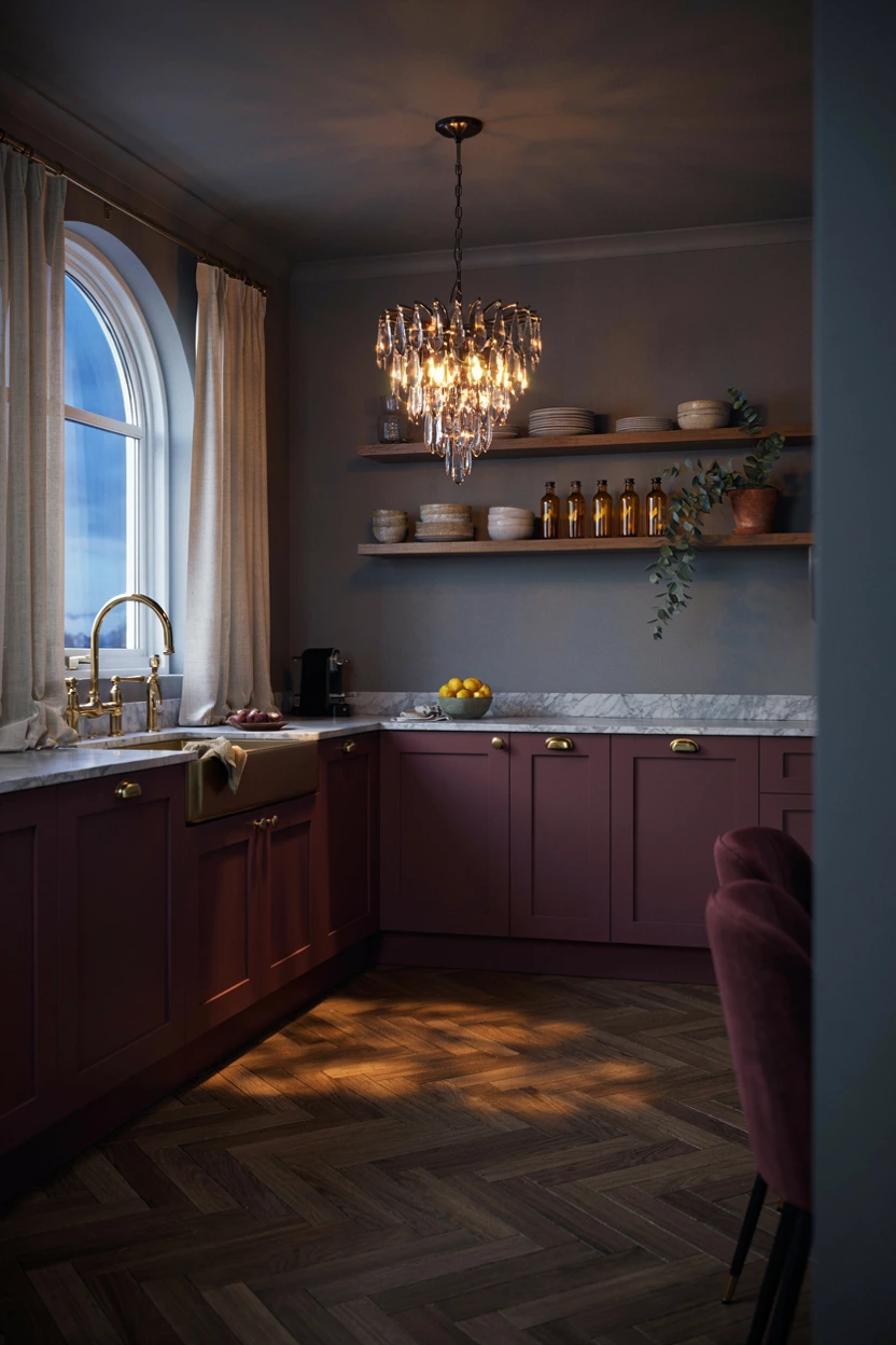
- Offers a dramatic, luxurious alternative to standard dark navy or black cabinet paint.
- Pairs splendidly with polished gold fixtures, warm crystal, and light marble tops.
- Anchors formal kitchen layouts and butler’s pantries with rich editorial sophistication.
- Hides lower cabinet wear while creating an unforgettable, moody guest atmosphere.
Rich deep plum cabinetry delivers an extraordinary, moody elegance that feels sophisticated, regal, and artistic. Eggplant undertones offer a unique alternative to classic navy or dark green, infusing the space with romantic editorial depth. When highlighted with glowing gold hardware, plum cabinets transform into stunning focal points that immediately command respect. In my experience, this dramatic palette excels in formal kitchens, wet bars, or butler’s pantries where homeowners want to create a rich, memorable mood. You achieve an opulent room that feels custom-crafted, luxurious, and full of design drama.
Balancing deep plum paint requires incorporating light-reflecting surfaces and warm natural wood tones underneath. Soft grey marble countertops with white veining lift the dark cabinets, preventing the lower layout from looking shadowy. Rich dark walnut flooring adds warm grounding undertones that tie the dark purple hues into nearby dining spaces naturally. Hang delicate gold or glass pendant light fixtures above islands to catch light reflections across dark cabinet doors. This sophisticated design approach creates a dramatic, high-fashion kitchen space that makes evening cocktail hours feel truly extraordinary.
Warm Ochre and Wood
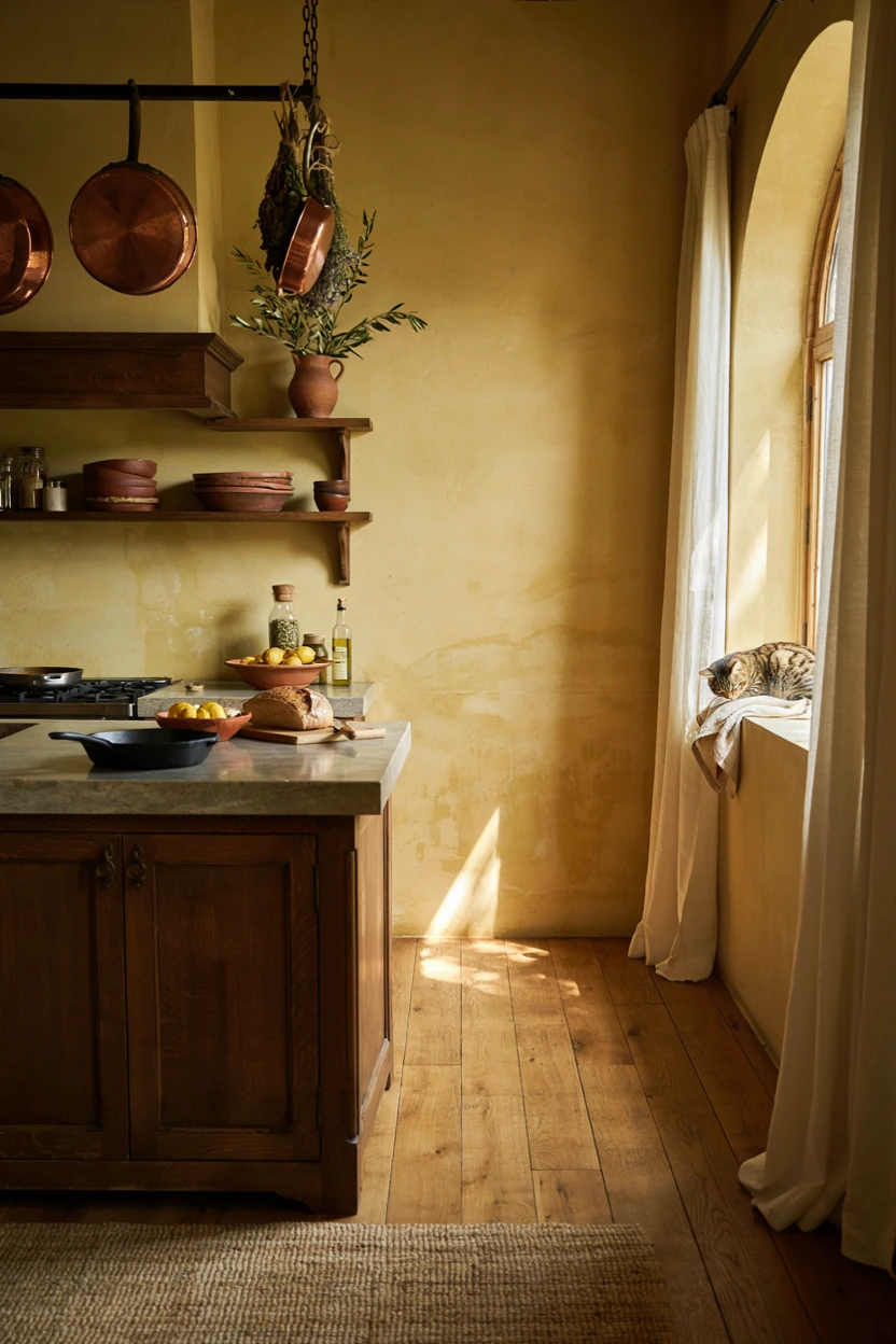
- Fills the kitchen with radiant, sun-baked warmth regardless of outside weather.
- Complements dark stained oak, soapstone counters, and rustic terracotta vessels.
- Stimulates appetite and conversation, making it ideal for gathering spaces.
- Softens harsh architectural lines through rich, textured plaster or painted surfaces.
Warm ochre yellow walls paired with rich dark wood cabinets create a sun-drenched, Mediterranean atmosphere full of artistic soul. Golden ochre paint captures daylight, radiating cozy warmth into every corner of your daily cooking area. Dark stained oak cabinetry grounds the vibrant wall color, creating a rich contrast that feels grounded and historic. That’s why many interior designers recommend ochre for spacious open kitchens where family and friends naturally gather. It creates an inviting, golden sanctuary that feels like a sun-soaked getaway in southern Europe.
Styling an ochre-infused space demands rustic material textures and dark stone accents that anchor the vibrant walls. Dark soapstone or matte granite countertops provide strong structural balance against warm painted surfaces. Display handmade terracotta pottery, dark wooden cutting boards, and copper vessels on open oak shelves to build rich visual layers. Aged bronze or forged iron cabinet hardware complements dark wood doors while honoring the old-world aesthetic. Exploring creative kitchen color scheme ideas like this lets you build a unique, heart-warmed kitchen space that feels rich, cozy, and timelessly expressive.
Soft Sage and Cream
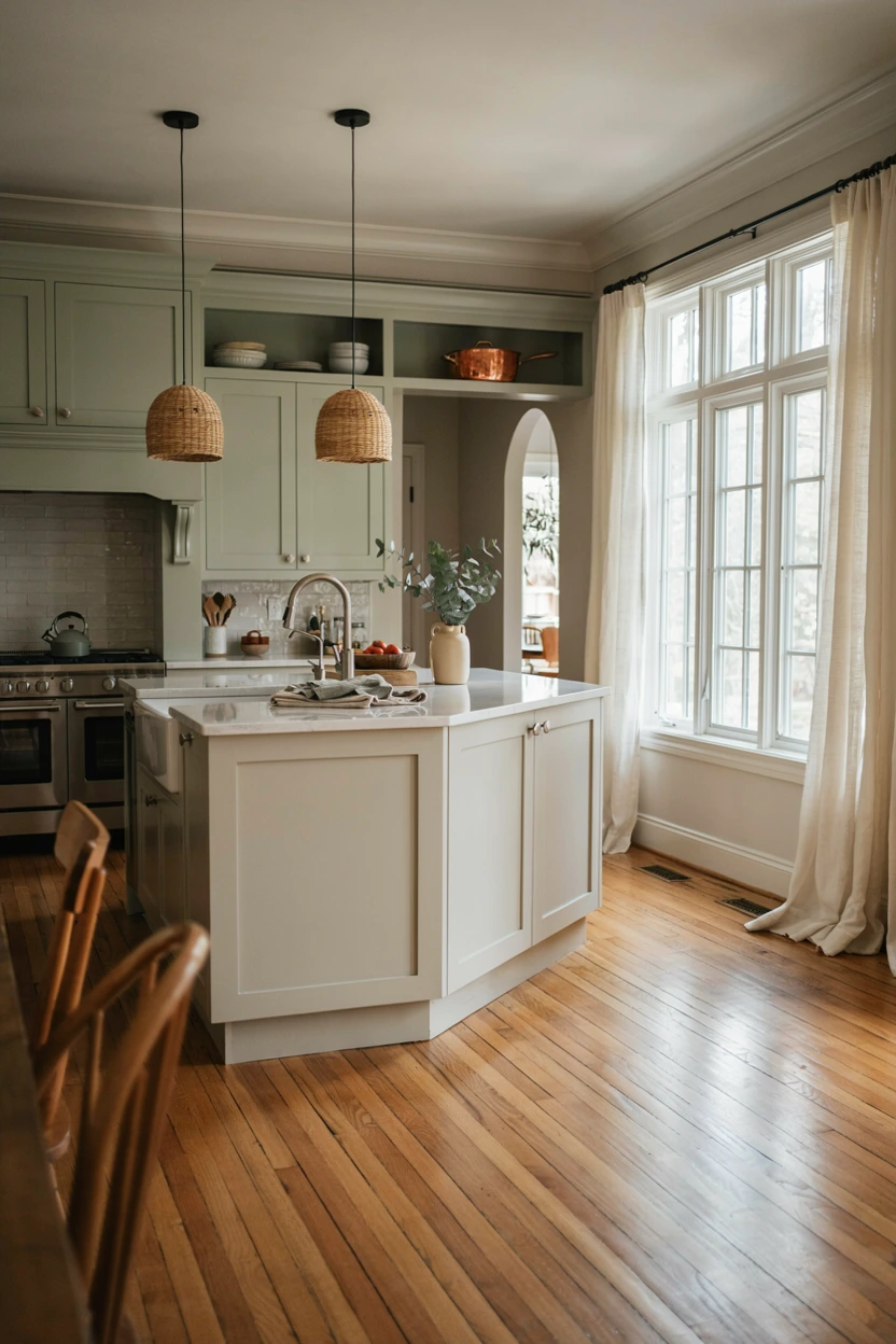
- Delivers a soft, tranquil color base that calms busy open-concept households.
- Bounces natural light around tight layouts without relying on stark white paint.
- Coordinates effortlessly with warm wood floors, nickel fixtures, and white stone.
- Creates a timeless, soothing aesthetic that maintains strong long-term home resale value.
Soft sage green paired with creamy off-white creates a gentle, traditional palette that instantly puts mind and body at ease. Muted sage cabinetry brings quiet botanical tranquility, while cream islands or trim details soften surrounding architectural lines. This airy color mix prevents white spaces from feeling clinical or cold, infusing subtle natural color into your daily environment. In my experience, soft sage works exceptionally well in busy family homes because its calming undertones create a serene backdrop during chaotic morning school rushes and meal prep hours.
Enhancing this serene color scheme involves combining classic metal finishes and subtle organic textures throughout the space. Polished nickel or soft chrome hardware adds crisp, clean sparkle against muted green shaker door panels. Seamless white quartz countertops keep workspace areas bright, clean, and easy to sanitize after daily cooking. Warm oak hardwood floors ground the soft paint tones, adding natural warmth underfoot across the whole layout. This delicate, timeless design approach delivers an elegant, peaceful kitchen environment that always feels fresh, bright, and deeply relaxing to live in.
Deep Charcoal and Brass
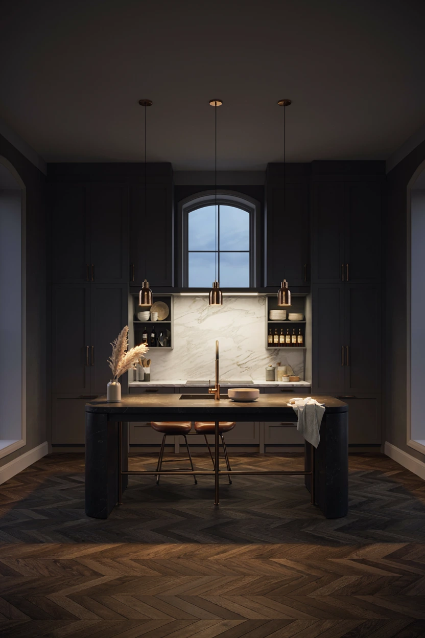
- Imparts a sleek, high-end hotel lounge vibe into modern residential kitchens.
- Hides lower cabinet scuffs, finger smudges, and daily kitchen wear easily.
- Elevates simple cabinet profiles into tailored, furniture-grade focal features.
- Pairs dramatically with brushed brass hardware, gold faucets, and white marble.
Deep charcoal cabinetry anchored by warm brushed brass hardware brings a sleek, high-end lounge aesthetic into the modern home. Dark grey paint provides intense dramatic structure while feeling slightly softer and more complex than flat black. Glowing brass handles and faucets slice through the shadowy cabinets, acting like fine jewelry against dark drawer fronts. That’s why many interior designers choose charcoal when designing sophisticated open-plan apartments. It defines the cooking zone as an elegant, adult entertainment lounge that naturally impresses guests during evening dinner parties.
Sustaining visual harmony in a dark charcoal kitchen relies heavily on bright splash backdrops and reflective flooring textures. White marble splash panels featuring bold grey veining bounce lighting back onto work surfaces, keeping food prep areas highly functional. Installing dark oak flooring in a refined chevron pattern adds rich geometric texture without introducing competing paint colors. Choose simple brass wire pendant lights above the island to preserve open sightlines across the room. This sleek design strategy creates an ultra-stylish, executive-level kitchen environment that feels remarkably polished, dramatic, and refined.
Dusty Blue and Walnut
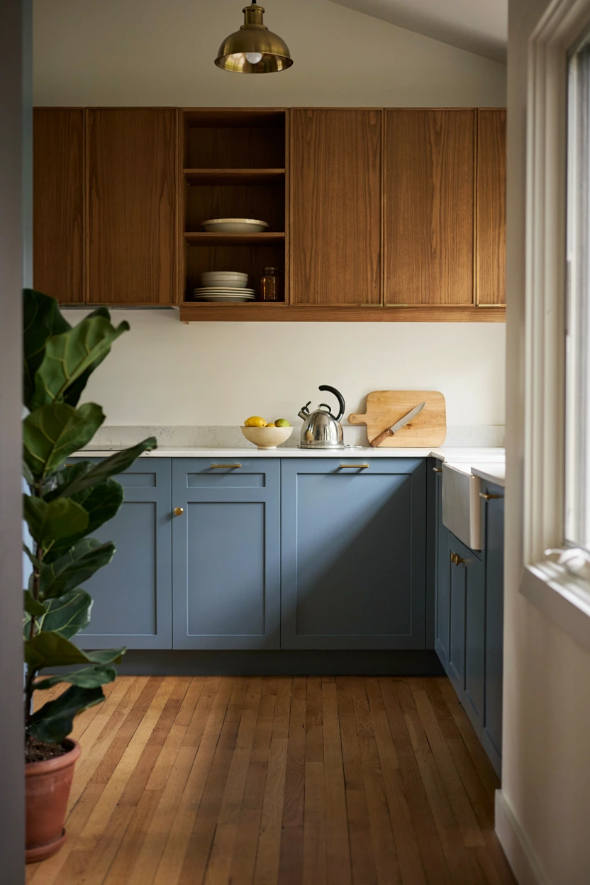
- Blends mid-century modern wood accents with cool, contemporary blue tones cleanly.
- Softens dark walnut wood grain through gentle, light-reflecting dusty blue paint.
- Delivers a stylish, retro-chic aesthetic that feels fresh rather than dated.
- Coordinates seamlessly with brass accents, white stone tops, and light oak floors.
Combining dusty blue lower cabinetry with rich walnut upper cabinets creates a mid-century modern masterpiece loaded with warmth and style. Muted blue paint brings a fresh, cool balance that brightens up dark, heavy wood grains without overwhelming the senses. Walnut paneling adds rich organic lines and vintage mid-century charm, making the upper wall feel warm, artistic, and tailored. In my experience, this mid-century pairing suits open floor plans where homeowners want furniture-grade cabinetry that blends into surrounding living room decor effortlessly. The space feels stylish, architectural, and completely unique.
Completing this mid-century modern look requires clean geometric hardware choices and crisp white surface planes. Seamless white quartz countertops bridge dark walnut wood and dusty blue paint, maintaining a clean, bright horizontal workspace. Brass globe pendant lighting and retro brass cabinet pulls reinforce vintage design roots while keeping the aesthetic sleek. Light oak flooring provides a warm, neutral foundation that lets walnut grain and blue paint shine as primary heroes. This clever color strategy delivers a mid-century kitchen space that feels effortlessly cool, warm, and stylishly timeless.
Read More: 22 Modern Kitchen Backsplash Inspiration Styles to Try
Soft Pear and White
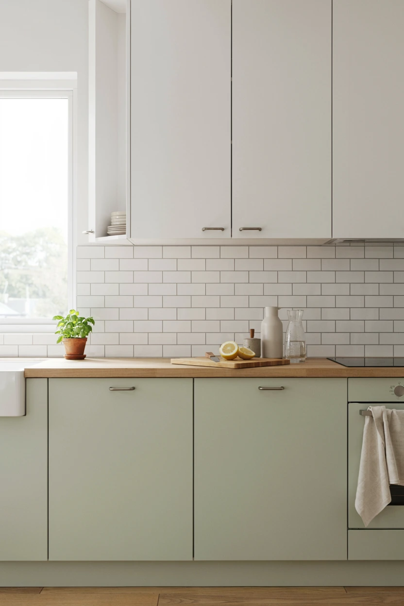
- Introduces a subtle, sunny pop of botanical energy into minimalist spaces.
- Expands compact kitchen dimensions through light-reflecting pastel cabinet tones.
- Softens white subway tiles and quartz surfaces with gentle organic warmth.
- Pairs delightfully with light beech wood, white fixtures, and fresh houseplants.
Soft pear green paired with crisp white creates an uplifting, light-filled environment that feels like a sunny spring morning year-round. Pear green contains subtle yellow undertones, making it significantly warmer and sunnier than cool mint or muted sage shades. Combining this cheerful green on lower cabinets with crisp white upper cabinets keeps ceiling sightlines bright, high, and completely uncluttered. That’s why many interior designers recommend pear green for north-facing kitchens or small studio apartments needing a light boost. It creates a happy, energizing space that makes morning routines feel joyful and fresh.
Styling a pear-green-infused kitchen calls for light natural woods and clean white tile surfaces throughout the layout. White subway tile backsplashes with white grout keep wall surfaces looking bright, simple, and easy to clean. Light beech or ash wood countertops add gentle organic warmth that complements yellow-green cabinet paint naturally. Select simple white ceramic or brushed chrome cabinet pulls to maintain an uncluttered Scandinavian modern look. Incorporating fresh kitchen color scheme ideas like this allows compact homes to feel surprisingly spacious, cheerful, and filled with natural botanical energy.
Conclusion
Redesigning your cooking space should feel like an exciting journey of self-expression rather than a chore. By exploring these diverse kitchen color scheme ideas, you now have the tools to completely revitalize your home environment. I’ve seen how the right home decor can completely transform a space and how it feels to live within it. Be sure to save your favorite looks on Pinterest, pick a palette to try yourself, and share this guide with fellow decor lovers! Embrace your creativity, trust your personal taste, and enjoy creating a gorgeous, welcoming kitchen you will love for years to come.